
Let’s start by refreshing on what my upcycle project actually is. I am using vinyl records that no longer play music as canvases for surrealism paintings. This way the records don’t end up in the landfills creating more pollution. Th surrealism aesthetic is a mix of realism and the creativity of the imagination. You can read more about the aesthetic and my project on these posts:
Surrealism Aesthetic: https://www.aesdes.org/2024/01/24/aesthetic-exploration-surrealism/
My Project: https://www.aesdes.org/2024/01/31/upcycling-project-surrealism-painting/
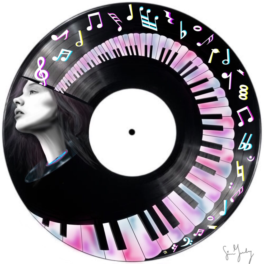
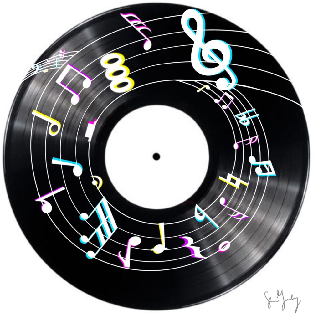
I also wanted to add a quick update about where I am in my project. I have started painting on the records. I decided to use acrylic paint because it is cheaper than oil and I felt that it was easiest to manipulate for this kind of canvas. I have run into a few bumps because of all the curves on the records but I have been able to work through it. I found that it causes texture in my painting which is not necessarily a bad thing. I think that although the texture wasn’t part of my original plan, it adds to the aesthetic. The sketches for my plan are shown below in Images 1 and 2, for comparison to the opposite aesthetic.
The opposite aesthetic that I could have chosen for my project is black and gray hyperrealism. This aesthetic is an art form that resembles a very high-resolution photograph. I think that this aesthetic is very opposite of surrealism because surrealism includes color and tends to look like an art piece, while black and gray hyperrealism looks like a photo taken straight from a camera.
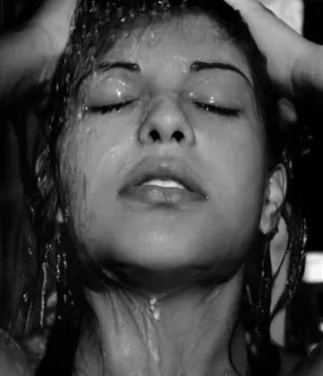
A famous artist for this aesthetic is Diego Koi. He uses the chiaroscuro technique which is a Renaissance shading technique. All his art is done in black and gray using a graphite pencil [1]. The results of these drawings are life-like and outstanding. Two of his pieces are shown in Images 3 and 4 below.


As you can see there are many differences between the black and gray hyperrealism aesthetic and the surrealism aesthetic. There are significantly more fine details added into the the faces of these art pieces than in surrealism. Surrealism is a very broad aesthetic because each and every person’s imagination and creativity can differ. Therefore, surrealism can include elements from hyperrealism but hyperrealism can not take elements from surrealism without changing the aesthetic all together.
The reason I decided to do surrealism is because I like the freedom to add creativity into my art. I think that using the surrealism aesthetic gives me more freedom to make the art my own and add whatever elements I believe will round out the piece. I also have been painting for a long while and tried out many different aesthetics including hyperrealism. The amount of time and patience it takes to perfect hyperrealism is not my style. I also think that hyperrealism would cause a bit of issues on a vinyl record, due to the immense amount of intricate details needed. The vinyl record is much harder to manipulate that a normal canvas and allows for less error.
Citations:
Images:
[3] Diego Koi. Koi, D (1989). Domestika. https://www.domestika.org/en/blog/4280-8-impressive-hyperrealist-illustrators-and-painters
[4] Diego Koi. Koi, D (1989). Domestika. https://www.domestika.org/en/blog/4280-8-impressive-hyperrealist-illustrators-and-painters
Blog:
[1] Domestika. (2021, August 31). 8 impressive hyperrealist illustrators and painters: Blog. https://www.domestika.org/en/blog/4280-8-impressive-hyperrealist-illustrators-and-painters
3 Comments. Leave new
Hi Sierra,
I think that hyperrealism is definitely the best choice for an opposing aesthetic to surrealism. I think that it is difficult to choose what is the opposite of an art style, given how each style can be interpreted in so many ways.
Hi Sierra, hyperrealism is a great choice for a contrasting aesthetic. I think you did a great job explaining how your chosen aesthetic is opposite to hyperrealism, especially black and grey hyperrealism. Great job!
Hi Sierra,
The images and examples you provided make it clear you put a lot of thought and consideration into how you would achieve a hyperrealism aesthetic when repurposing vinyl records. If I did not know your original aesthetics post, I would have thought it was your main project from how clear your vision and plan was! I am curious if you considered how you could create a strictly black and white “photography” styled upcycle on an already white and black item. What are your thoughts on the materials you could use, would you either stick with acrylic paint or find different textures?