
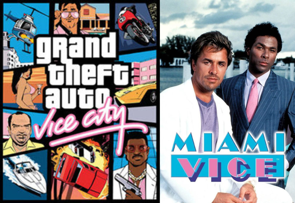
Before researching into this aesthetic, I always called it “Miami Vice”. I think this stemmed from a combination of seeing reruns of Miami Vice and the video game Grand Theft Auto: Vice City which each took advantage of the color palate and nostalgic feeling that is often incorporated into this aesthetic.
The aesthetic is more officially known by the name “Outrun” or sometimes “Synthwave”. The origins of this more refined aesthetic stem from the more broad aesthetic that would be deemed an “80s” aesthetic. Movies, restaurants, clothes, commercials, and artists in the 80s often used the neon color pallet, geometric patterns, and graphics in their designs. The overall “80s” aesthetic can actually be pinpointed to a specific origin. Memphis Group was an art collective comprised of architects and designers from all across the world who are actually credited with introducing art collections into the world that heavily influenced the overall aesthetic of the 80s (Lee).
Memphis Group was heavily influenced by radical design. Radical design has it’s roots in Italy as a response to the restrictive nature of minimalism, radical design operated in quite the opposite sense and was the main driving force behind a lot of Memphis Group’s pieces (Sowden). The group sought to create highly unique and colorful décor and furniture at the trade off of functionality. Although their work never saw main stream success in furniture catalogues and homes, when observing their work it is obvious to see the heavy influence they had on 80s fashion, art, colors, and culture as a whole and how that inception would eventually lead to the aesthetic at hand, “Outrun”.
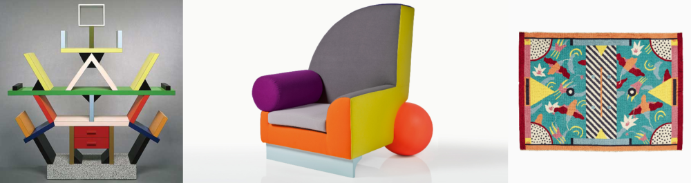 Different pieces created by Memphis Group in the 80s
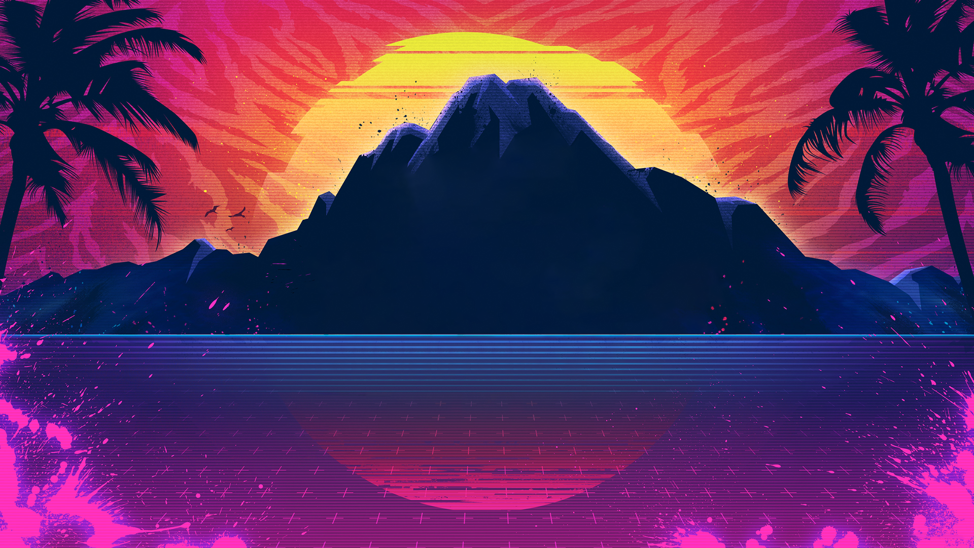
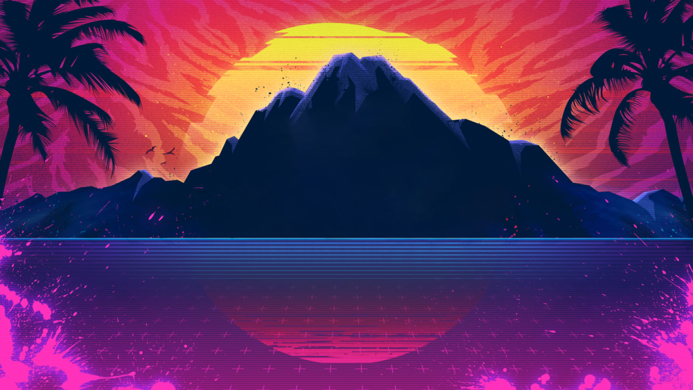
While this aesthetic was tweaked and expanded into what is a wholly new feel in the 90s, modern “Outrun” as we know it did not become very prevalent until the late 2000s. The biggest step forward that differentiated itself as a new aesthetic was the feeling of nostalgia it invokes when used today. “Synthwave” music, which namesake stems from the heavily used synthesizer instrument of the 80s, will often use sound clips and samples from retro commercials, movies, songs, and games to conjure up that elusive nostalgia. Even album covers related to this will feature bright neon with geometric patterns or edited photos pulled straight from the past In modern interpretations, the neon is cranked way up to almost give the feel that the neon colors are actually neon lights themselves. It is also used to capture the 80s interpretation of the future that was seen in movies like Back to The Future 2 which is now referred to as retro futurism. Anytime an art medium wants to pay homage to or capture the feel of the 80s, this is the undoubted go to aesthetic.
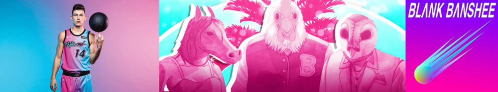
Modern Examples of Outrun
What started as a concerted radical effort from a group of rag tag artists in the 80s has blossomed into beautifully colorful nostalgic time capsule of pop culture and artistic culture past.
IMAGES
1. https://www.ubisoft.com/en-us/game/trials-of-the-blood-dragon/
2. https://www.nbc.com/miami-vice
3. https://en.wikipedia.org/wiki/Grand_Theft_Auto:_Vice_City (Fair Use)
4. https://www.usgamer.net/articles/nuts-for-nintendo-2020-video-from-the-80s-proves-the-more-things-change-the-more-they-stay-the-same
5. https://www.imdb.com/title/tt0087277/
6. https://www.architecturaldigest.com/story/design-inspiration-90s-taco-bells
7. https://italychronicles.com/italian-design-focus-on-the-memphis-design-movement/
8. https://www.dezeen.com/2016/10/17/five-best-most-iconic-david-bowie-memphis-furniture-design-collection-sothebys-auction-london/
9. https://www.nba.com/news/heat-unveil-vice-versa-uniforms
Sources
1. https://www.vox.com/videos/2017/6/27/15879660/80s-aesthetic-memphis-design
6 Comments. Leave new
[…] и небоскрёбов. Эта эстетика, называемая сегодня «Synthwave» или «Outrun», уходит корнями в дизайн-моду 1980-х, которую […]
[…] Aesthetics of Design […]
First off, “Miami Vice” sounds a lot better than the real technical names for this aesthetic, so great job in that regard. Next, I love how you tied together all the forms of media this aesthetic existed in as well as it’s roots in 80’s radical design. You did a great job in giving examples of it(in your essay and your images) as well as explaining how this aesthetic was used and evolved over time. One thing I wish I saw more of would be an exploration into the resurgence of this aesthetic we see today in a plethora of media.
Thanks for your comments! I agree that I could have delved more into the resurgence of this as a whole but I could not find an exact inception. It seemed to just explode out of nowhere and it’s kind of hard to pinpoint how or why since this aesthetic technically has been around since the 80s just with a modern coat. I will look more into that though and let you know what I find!
Ben, this is a super cool post! I love how you could logically make connections between music, video games and furniture all with one aesthetic.
One element that I noticed in the aesthetic that you didn’t touch on was the “flattness” of all of the graphics. If you look at other types of design, you will see that they use shading to create contrast and make the eye think a 2D image is 3D. In contrast, if you look at the lettering, geometric patterns, and even the furniture, you will see that they all look quite flat. The “flattness” seems to be okay because of the aggressive color use. If this doesn’t make sense, an area where flat design is extremely common (and can be contrasted to non-flat designs) is in UI. Take a look at the app icons in the app store. If you look back at the gmail icon from 10 years ago, it was much bubblier than the current flat design.
You really made me want to crank up some synthwave, fire up the old PS2 and play some GTA Vice City!
James, you are totally right with the 2D/3D layout a lot of these have, it’s very prevalent. I did not even really notice how integral that was, probably due to it being so common I just managed to over look it. I think that is once again cashing in on nostalgia as it seems to harken back to a lot of old video games that were limited by their processing/graphic power and had to use visual illusions to convey a 3D world within a 2D format. A lot of pieces of art surrounding this use a grid to convey some depth and that is definitely influenced by movies like Tron and video games on home consoles like the Commodore64 and SNES. Good catch!