
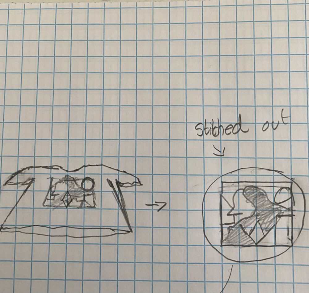
I have always been a fan of graphic novels and comic books of all types and I love the variety of and diversity of art styles that can seamlessly be put together under the aesthetic of Graphic Pop Art. So, for my final project, I knew I wanted to incorporate it into some type of wall decor that can be arranged as art and/or general wall hangings, so I decided to customize and update a clock since it is dynamic and works as wall decor.
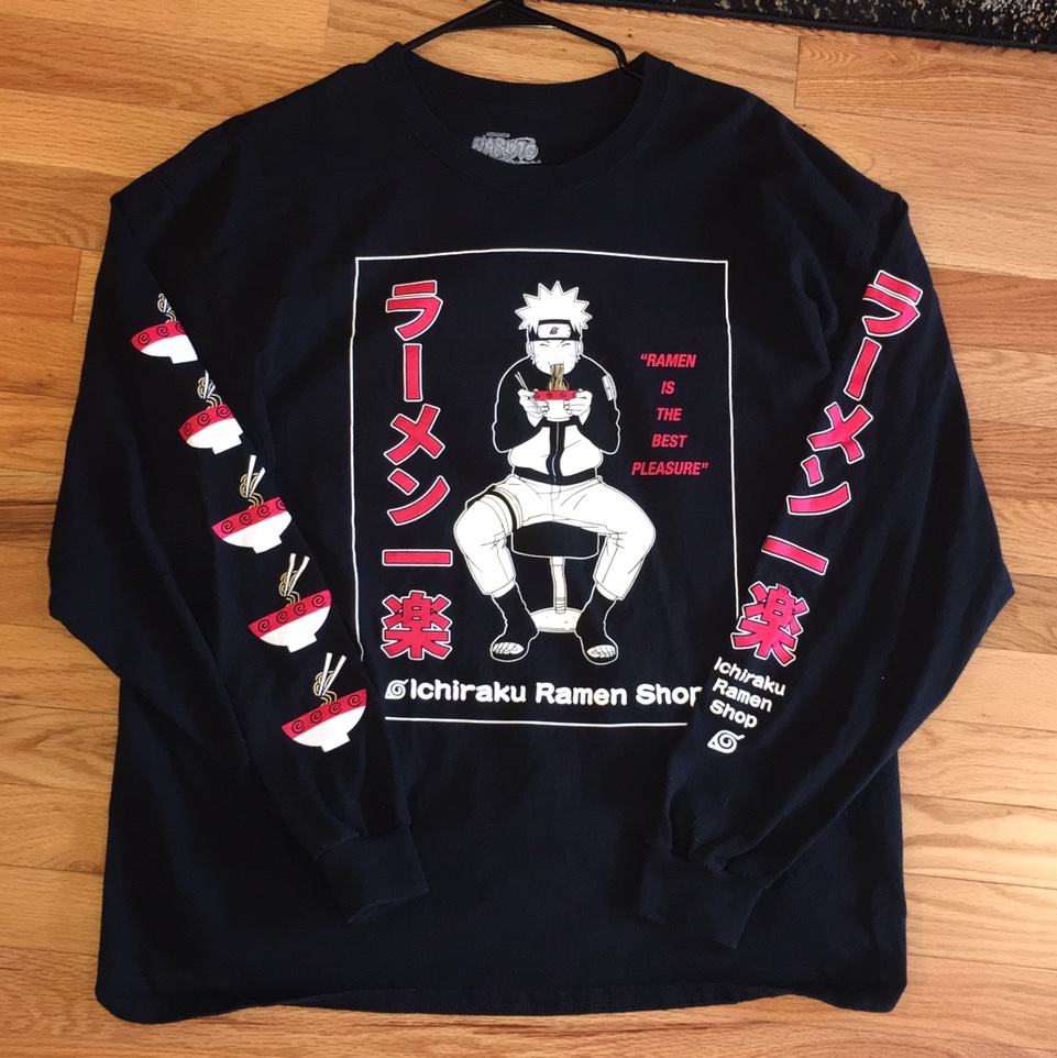
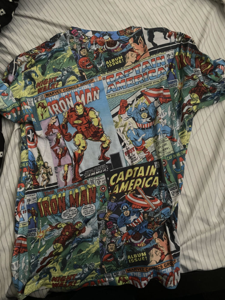
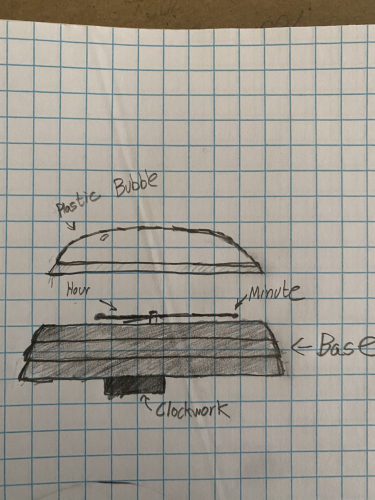
Graphic pop art can be defined as a multi-colored, high contrast, and semi abstract genre of pop art influenced by graphic design. It also makes use of bold colors that can stand out or even compliment each other. Most of this type of art can be seen on cheap graphic t-shirts as well as psychedelic posters and tapestries. I had a lot of graphic pop art clothing and artwork growing up and incorporating into artwork was going to be a fun challenge for me. I wanted to combine materials such as paint, clothing material, plastic canvas, wood, and even just paper. I ended up using all of them except for wood since I ended up not needing it. I knew I still wanted to use different bright colors in a way that wouldn’t take away from any of the functionality of reading the clock. I also knew I was going to blend different graphic art styles on my piece as well so I needed to do that coherently and cleanly. In terms of functionality, I knew the clock needed to be usable so I had to place the art styles in a non distracting arrangement while keeping the clockwork. Below I have my graphic art inspirations, the clothing material I ended up using, and my sketches for the project
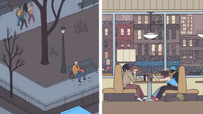
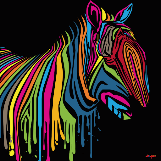
Source 1 and Source 2
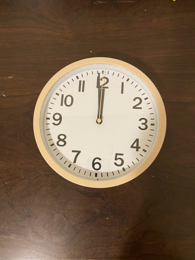
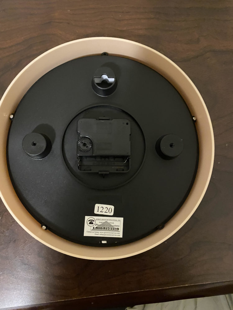
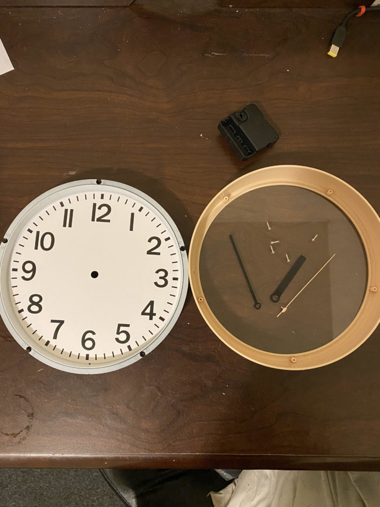
I ended up buying a new clock to update and customize . Below is a picture of it assembled and dissembled before I tweaked it. I ended up taking apart the face of the clock from the overall frame. Then, I took the back piece of which had the clockwork and was connected to the hands. Then, I was able to take the hands and separate them in order to separate them for the rest of my process.
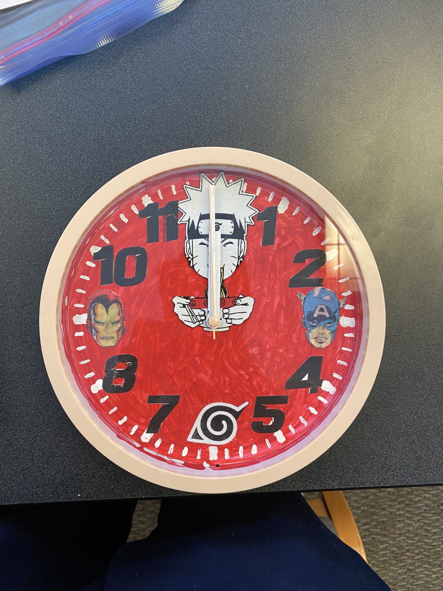
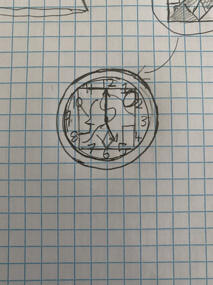
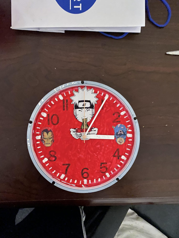
Then, I painted over the the face of the clock. I started with a black paint, but it ended up showing up as a dark blue. So, I painted over that with a deep blood red which actually made the face pop out more. Also, the color and rough filling of the paint actually added to the graphic art aesthetic. Then, I cut out pieces from my graphic art shorts, and I put them in the 12, 3, and 9 positions. After that, I was able to add numbers which were graphic art font numbers and placed them on all of the numbers except 12, 3, 6, and 9 which was where I put the icons Naruto, Captain America, Leaf Village Symbol, and Iron Man, respectively. Then, I added the hands back on after I painted them white. Below are the pictures.
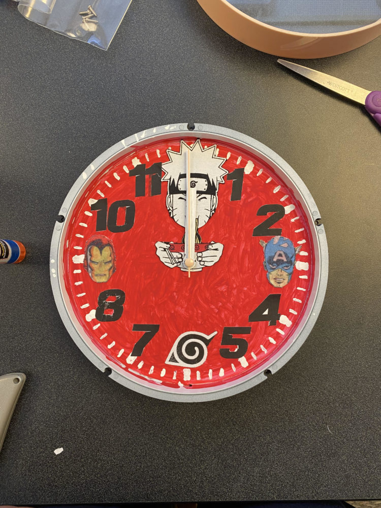
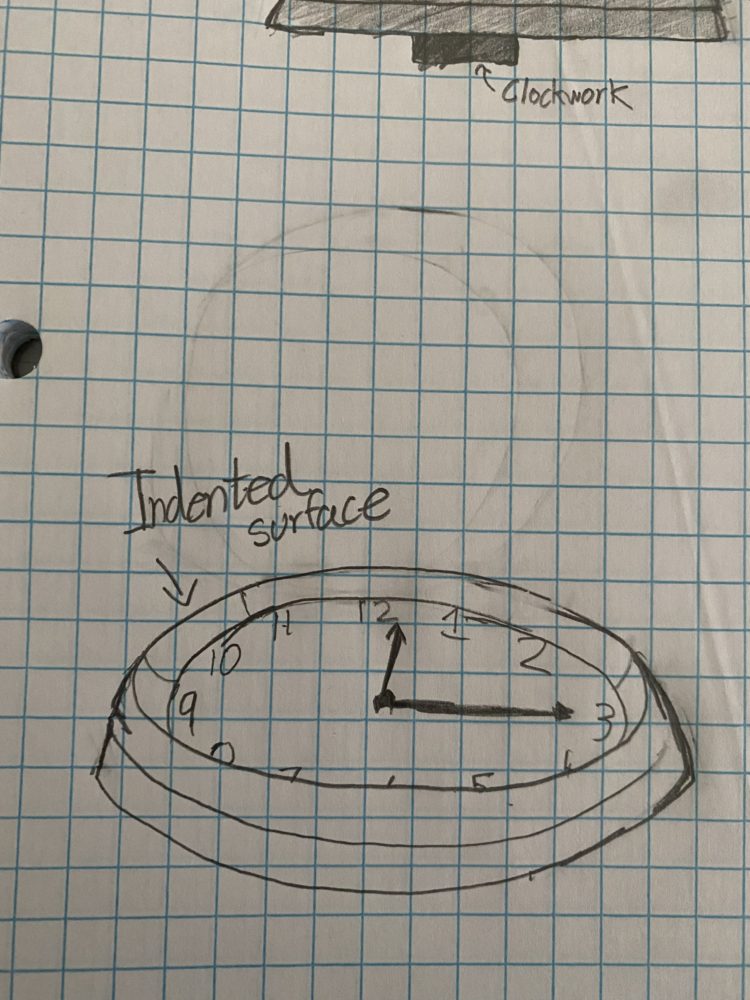
Then, it was time to add the final touches to the project. I had to enclose it with the original exterior enclosing, and then I added clockwork to the back of the clock. This made the clock completely functional.

Timeline:
1st Day: I took apart the clock and disassembled it. I took the parts and started working on individual pieces like the hands and the face.
2nd Day: I was able to complete the coloring of the face and the minute swatches. I had my art pieces cut out ready to be placed and they were.
3rd Day: I settled on the design of keeping the face as is with an additional icon at 6 and new font numbers on the remaining numbers. Then, I put the hands back together with the clockwork and the exterior.
In my original planning, I wanted to cover the exterior with either paint or a design that could be glued or carved on the outside. I tried to glue on a design to test it out but it kept slipping off and peeling. I didn’t have time to pursue it. If I had more time, I would come up with more icons and have them in pairs that relate to each other and have them on the other numbers. I also would do more design on the face.
Source:
Source 1: Murray, C. (2010). Graphic novel. Retrieved March 15, 2021, from https://www.britannica.com/art/graphic-novel
Source 2: [Graphic art of a zebra in rainbow colors]. (n.d.). Retrieved from http://clipart-library.com/clipart/kc85MxGji.htm
1 Comment. Leave new
Nice article https://mechanicalboost.com/