
Psychedelic rock art of the 1960’s and 70’s was defined by bright bold colors and wavy space filling patterns. The artist Wes Wilson kickstarted this movement in San Francisco when he began to bend and morph the lettering in his posters to fill the spaces in his art. Other artists in and around San Fransisco quickly picked up on the technique and many began to similarly distort the lettering and images in their posters. The style drew inspiration from pop art and art nouveau movements, as-well as the 60s counter-culture movement against the War on Drugs and the War in Vietnam. Wes Wilson said he wanted to bring a lighthearted mood with his art in a time of darkness.
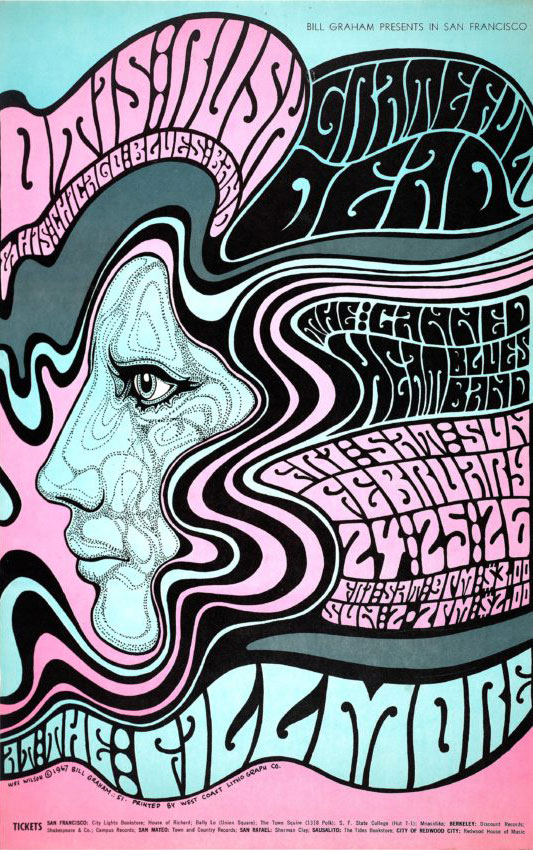
Wes Wilson for Otis Rush and Canned Heat at the Fillmore, 1967
Other notable artists of the era include Bonnie Maclean, Victor Moscoso, Alton Kelly, Rick Griffin, and Stanley Mouse. The famous Fillmore Auditorium and its owner Bill Graham helped to enable the popularization of the psychedelic style by contracting these artists to make their concert posters from 1965 through 1970. The style was meant to grab and hold people’s attention, and with the distorted form of the letters sometimes almost illegible, people were entranced.
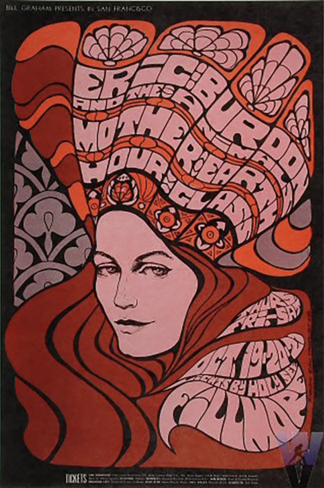
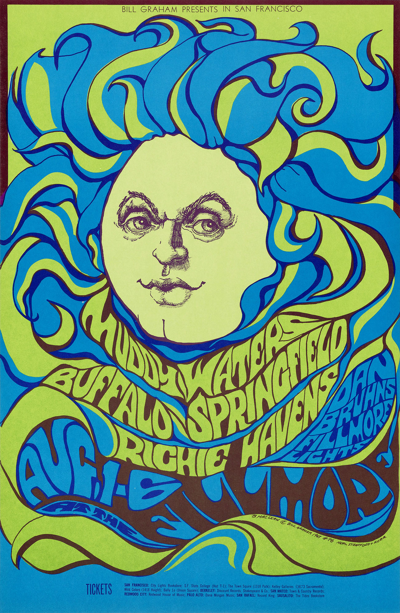
Bonnie Maclean for the The Animals, Mother Earth, and Hour Glass in 1967 (left) and for Muddy Waters and Buffalo Springfield in 1967 (right) both at The Fillmore
The style was defined by bright complimentary colors, flowing patterns, and most notably, the wonky, fluid like lettering that blended the art and the message together, The posters were mass produced by offset lithographic company Tea Lautrec based in San Francisco. And while the popularity of the style drove it too spread to other popular music scenes, nowhere else compared to the sheer quantity of the art produced in San Francisco.
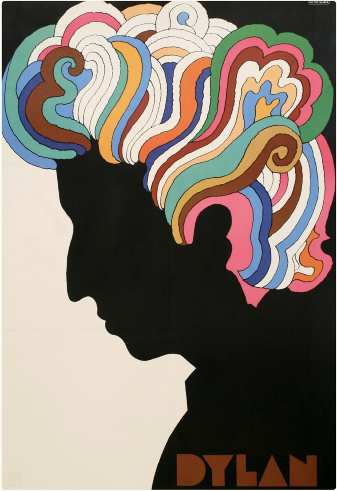
Milton Glaser for Bob Dylans Greatest Hits album 1967, reported to be as many as 6 million copies
![]()
Bonnie Maclean for The Who at the Fillmore, 1967
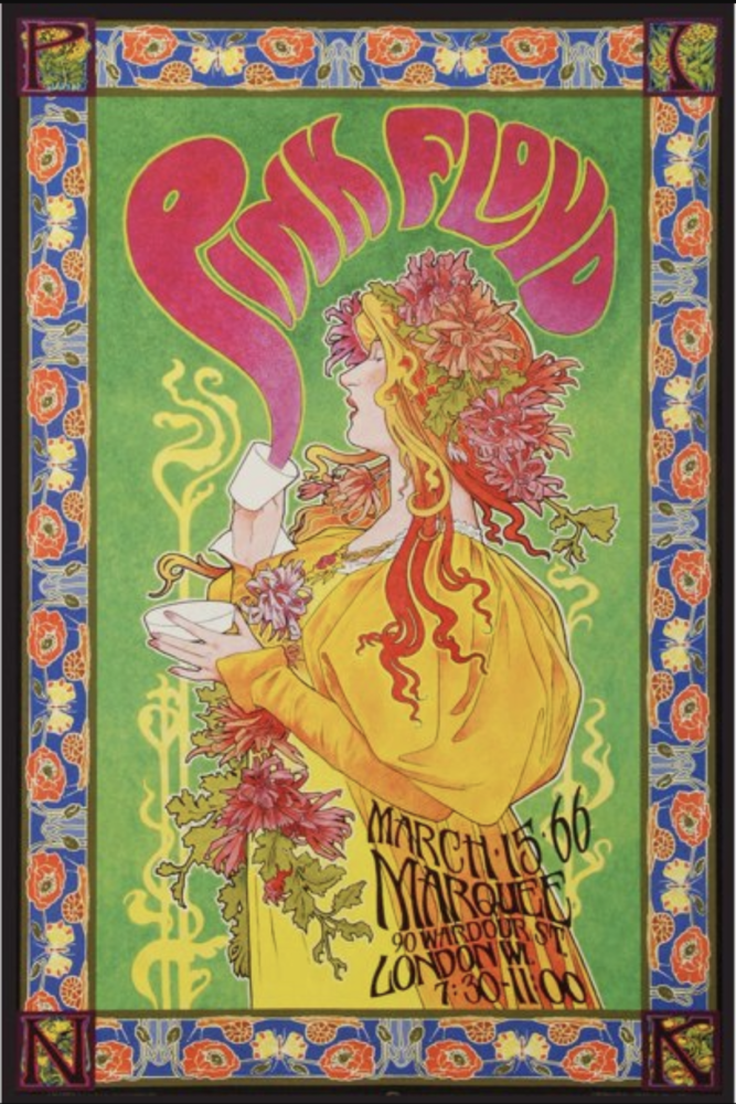
Bob Masse for Pink Floyd at the Marque in London, 1966
References
- Ltd, S.-V. (2021, May 7). The big five – the san francisco poster artists. Stan Ray. Retrieved February 1, 2023, from https://www.stanray.com/blogs/journal/the-big-five-the-san-francisco-poster-artists
- Genzlinger, N. (2020, February 20). Bonnie MacLean, psychedelic poster artist, is dead at 80. The New York Times. Retrieved February 1, 2023, from https://www.nytimes.com/2020/02/20/arts/bonnie-maclean-dead.html
- Tea lautrec litho • the rock poster society. The Rock Poster Society. (2019, September 13). Retrieved February 1, 2023, from https://trps.org/resources/tea-lautrec-litho/
- Milton Glaser’s Bob Dylan poster. Smithsonian Music. (2018, November 20). Retrieved February 1, 2023, from https://music.si.edu/object-day/milton-glasers-bob-dylan-poster#:~:text=It%20was%20a%20new%20form,the%20Wind%22%20and%20%22Mr.
1 Comment. Leave new
This is a very distinct aesthetic and I found it very interesting. The poster images you included are certainly fascinating and, as you mentioned in your post, lured me into reading through each poster. I enjoyed the complementary color scheme each poster has. Even though the poster is filled up with pompous scripts, It all flows well and imprints an image of the poster in my mind. Is this aesthetic still being used for posters or advertisements today or has it all calmed down into a more sober and compact approach? and what, in your opinion, might be the reason behind it? As I look at it, this aesthetic more than meets the requirements of advertising an event and draws people into reading through.