

After researching Dadaism for the Aesthetic Exploration post, I became inspired by one of the artists I found; Dash Snow. I really liked the way he arranged his collages and how some of the themes he created were easily identifiable.

(1) The End of Living and the Beginning of Survival, Dash Snow, 2008.
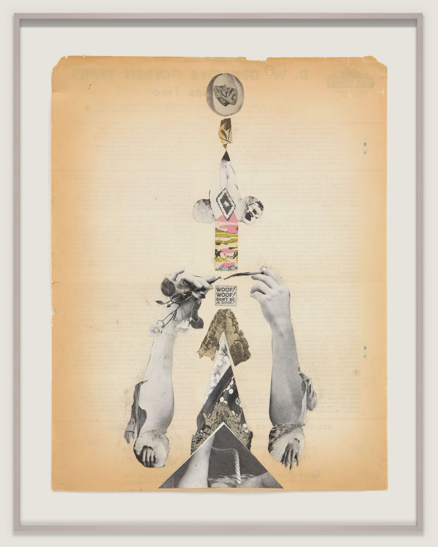
(2) Moran Moran, Dash Snow, 2006.
I wanted to create a set of collages similar in style to the work of Dash Snow. I thought making multiple collages with different themes would really emphasize the style consistent throughout them all while also lessening the impact and significance I would need to impose on one single collage.
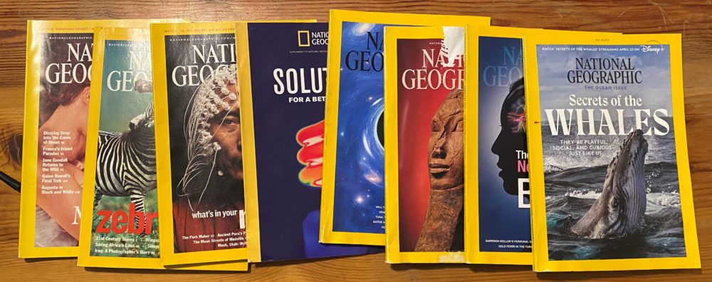
I began by searching for the content I would arrange in my collage. I knew magazines would be a good place to look because of the surplus of images inside. After asking around, I learned one of my friends had a large collection of National Geographic magazines that he no longer needed. I flipped through a couple of them and picked out the best candidates. After assessing the content I had to choose from, I decided to make one collage focussing on the effects of war and another on the effects of climate change. Below is a photo of the 8 magazines I used for my project.
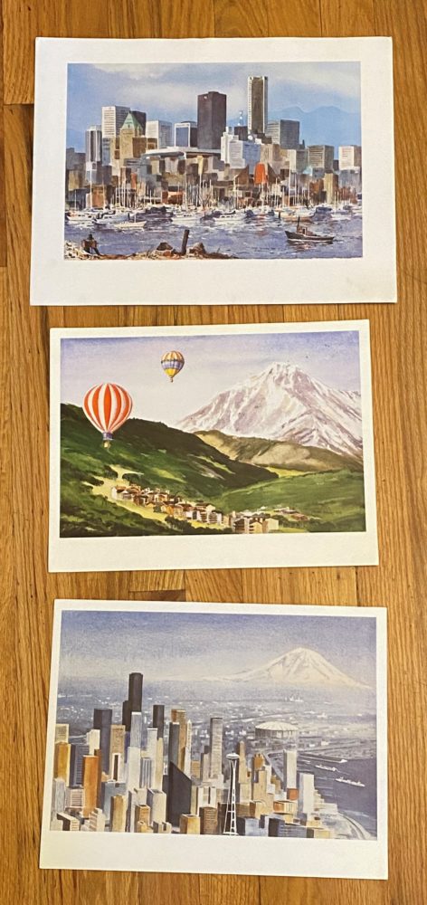
The next step was finding a backdrop for my collages. I wanted a backdrop that had some type of tie to the theme. Additionally, I didn’t want the content in the collage to cover up the backdrop too much. I also wanted the style of the backdrop to contrast with the content I would be using. National Geographic magazines are filled almost entirely with photos so I thought paintings would be a good fit. I decided to arrange these collages on top of paintings that had been donated to the TRU Hospice Thrift Store in Boulder. I found a series of 5 prints of impressionist paintings illustrating cities and the countryside. I knew I wasn’t making 5 collages but I liked these prints so much that I bought them all and decided I would just hang up the ones I didn’t use as a backdrop. Below are the 3 prints I decided not to use.
At this point, I had all the materials and was ready to begin cutting up my magazines. I combed through each page of each magazine and cut out anything that seemed interesting or related to my themes. Initially, all my cuts were rough and their only purpose was to give me a general idea of all of my options for content and layout. Below is an image of the rough cuts mentioned above.
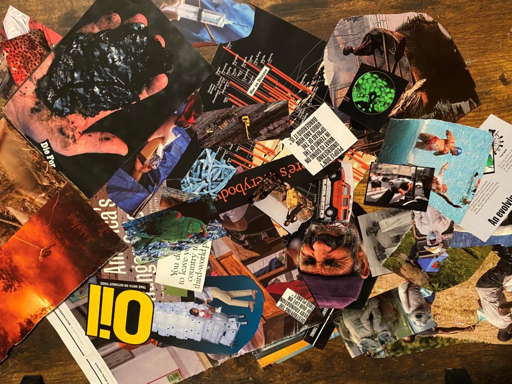
After several hours of snipping, I felt I had exhausted my source and began organizing my cutouts based on which theme they would fit into better. After organizing, I picked out a backdrop and began arranging my content on top. I did a lot of trimming and slicing of my images in order to fit everything on the backdrop in a non-intrusive manner. Once I felt I had a good layout, I began gluing pieces down. It was critical that any images which were to be partially covered up, got glued down first.
After I had adhered all the elements to each of my backdrops, it was time to find a medium to display my work in. I first checked the garage in hopes that there would be some old frames gathering dust. I found a frame made to resemble black granite. On the inside was a gold accent running all the way around the frame. I held this up next to each of my collages and liked how it paired with the war theme. I cleaned off this frame and inserted my collage. After failing to find a suitable frame for the climate change collage, I started sifting through other options for display. I thought that adhering it to a recycled piece of wood would be fitting. As someone who is always picking things up from the side of the road, I have a surplus of recycled wood which was perfect for this. I chose a clean, and nice-looking board and made a cut just larger than my collage. Shortly after, I sanded and then glued my collage to this board.
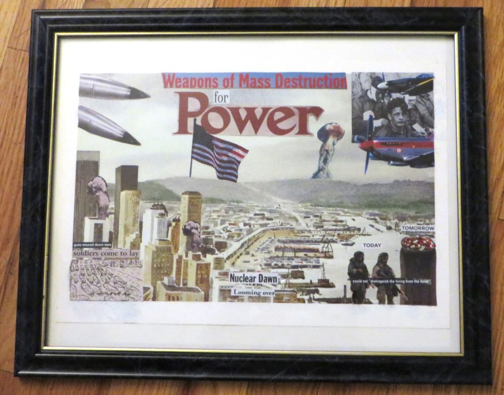
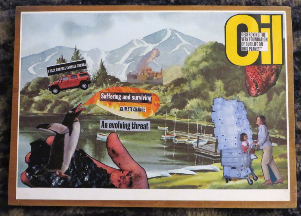
Aesthetically, I feel that I’ve succeeded in my goal. Each collage has an easily identifiable theme and I think the layout of the elements compliment the backdrop rather than covering it up. Additionally, I think some of the overlapping images helped to create a more interesting composition.
Functionally, I feel like I have missed the target a bit. While each collage has a clear theme, I feel like neither is very cohesive as a single piece of work. I don’t see a distinct message in either. Instead, it feels like I’ve created a smorgasbord of buzzwords and eye-catching images which are loosely related to the true issues I hoped to shed light on.
The next step for these collages is to be hung up. I think that I might hang them alongside the remaining prints I got from the thrift store.
(1) https://www.amazon.com/Dash-Snow-Living-Beginning-Survival/dp/393135542X
(2) https://www.phillips.com/detail/dash-snow/NY010618/166
3 Comments. Leave new
How does the composition of color and shape in Nat Geo Collage create a certain mood?
Regard Telkom University
What is the most prominent visual element in Nat Geo Collage?
Regard Telkom University
Lucas,
Your collages came out incredibly well. Whilst you state that the pieces aren’t cohesive, I choose to disagree. Your pieces have large text mixed with vivid imagery, and while some of the words may be “buzzwords”, and the images appear random and chaotic individually, the cohesion within your collage is undeniable. Both pieces are incredibly well-made, and a message or theme is clearly conveyed. Collages, by nature, aren’t necessarily cohesive, but a mix of things with a connecting theme. Furthermore, Dash Snow’s pieces generally seem to flow from one photo into the next, and I believe whole-heartedly that you have matched his aesthetic rather well.
Well done!