
My project, a side table that incorporates a record as its top surface, will be constructed to fit the 1970s aesthetic. Although this is not as distinct of an aesthetic as something such as steampunk or brutalism, there are numerous common design styles, colors, and motifs that embody the 1970s. Before explaining why minimalism is the opposite of my project’s aesthetic, I will first provide some background on the 1970s aesthetic.
In broader terms, the 1970s aesthetic consists of bright and bold colors, lots of floral and natural elements, and overall a maximalist approach. As seen in the image below, music, movies, cars, politics, and other elements greatly influenced culture in the 1970s and therefore the aesthetics that followed.

1970s aesthetic poster [1]
More specific to my project, the interior design of the 1970s also followed many of the same overarching themes. In the picture below, we can see multiple vibrant colors with an emphasis on natural elements such as flowers and houseplants. The two round pillows on the couch display a pattern that I may take influence from on my project.
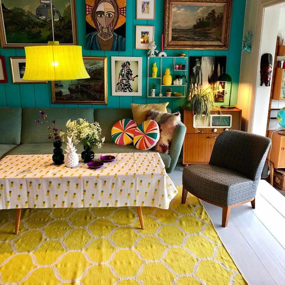
1970s interior design and furniture [2]
After analyzing the aesthetics of the 1970s, I believe that minimalism is the most appropriate opposite aesthetic. Instead of bold, bright colors and natural elements, minimalism generally includes more muted tones and inorganic elements. Going back to the image above, we can see that the amount of trinkets, fixtures, art, and other objects creates a more elaborate and maximalist feeling. Minimalism is, by definition, the antithesis of this.
If I were to design a minimalist side table instead of my current project, I would envision something with the simplest possible build. Everything in the design would be necessary and not over-embellished. Additionally, the color palette would be straightforward, only using one or two tones.
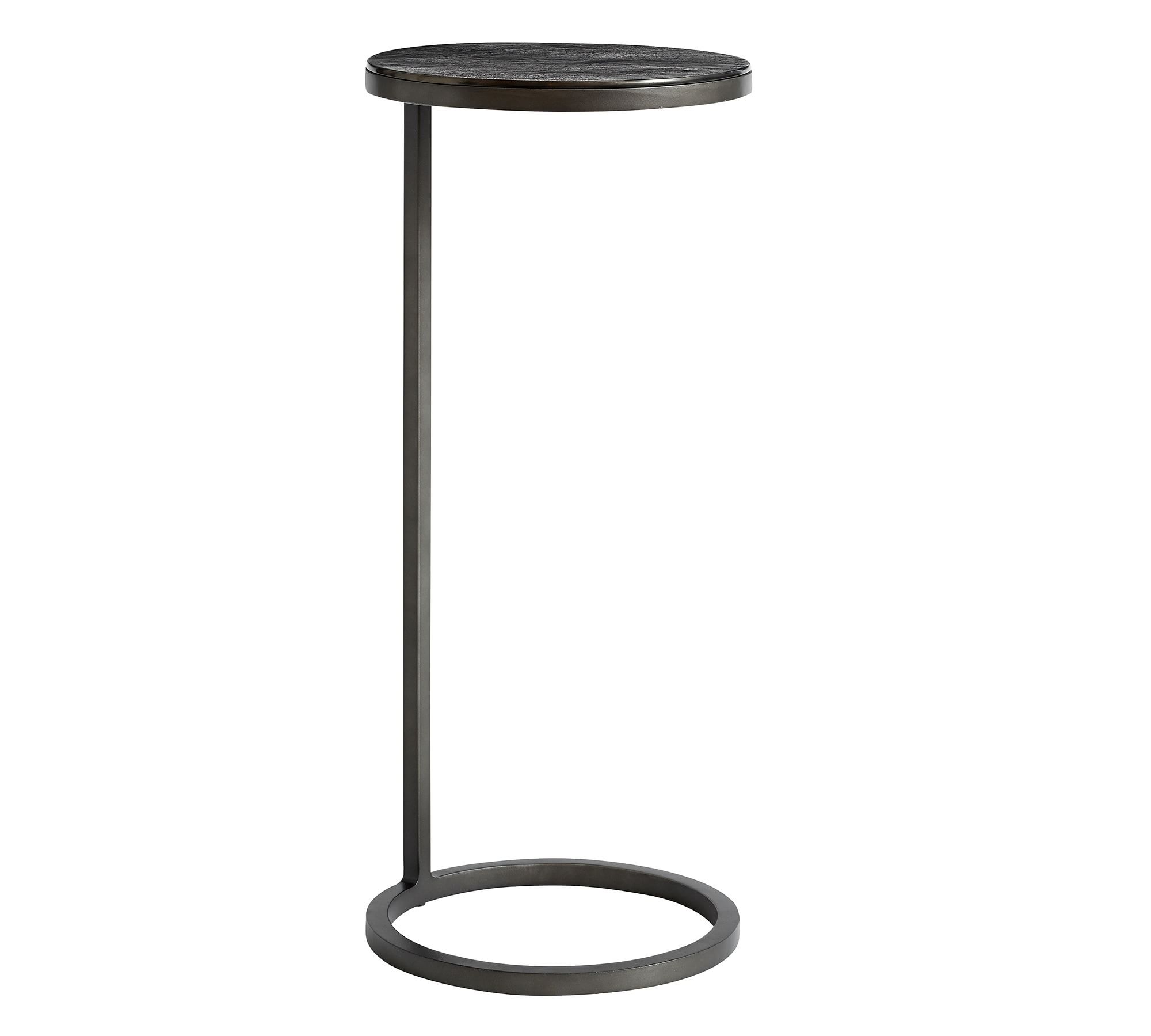
Minimalist side table [3]
In the image above, we can see a minimalist side table. I chose this example because it also has some round features, similar to how my actual project will end up looking. While minimalism is a broad aesthetic, this side table does a good job of displaying its identity. Everything that is included in the structure of the table has a purpose and nothing is added for decoration. In some ways, I do appreciate the beauty in the simplicity of minimalism. This clean design also makes manufacturing a lot easier, in most cases.
It was interesting to compare my project’s aesthetic to its opposite aesthetic for this post. This exercise helped me to further define the 1970s aesthetic by comparing and contrasting it with minimalism. For the final project in this class, I have already started brainstorming what aesthetic I may choose and minimalism is a contender. The simple yet purposeful design makes fabrication more straightforward and generally cheaper as well. The influences of minimalism can also be seen in other aesthetics, one of my favorite being Scandinavian design. While the 1970s aesthetic is a stark inverse of minimalism, I can acknowledge the beauty of both.
Sources:
[1] https://www.deviantart.com/jj-247/art/Back-to-the-70-s-Aesthetic-PNG-Pack-894480311 [2] https://www.thespruce.com/70s-decor-4692747 [3] https://www.potterybarn.com/products/duke-bronze-accent-table/?catalogId=84&sku=1275469&cm_ven=PLA&cm_cat=Google&cm_pla=Furniture%20%3E%20End%20%26%20Side%20Tables&cm_ite=1275469_14546951676&gad_source=1&gclid=Cj0KCQiA5rGuBhCnARIsAN11vgS7It0smYVHIkLc-AROQnrOiMg9MhnBDphpi_X3OgTsSUy25i8h0NsaAgdcEALw_wcB
4 Comments. Leave new
Arjun, I think that the minimalist style you are going for is a very cool idea. It sounds like a win win if fabrication is cheaper and easier than normal. What sort of material or object are thinking of for the table top?
I can imagine the record table sitting in the room in the second image and looking like it fits right in. Can’t wait to see the finished product! Maybe in your final post you could photoshop it into that picture and see how seemlessly it blends in.
Hey Arjun, I really liked the depth you went into for the contrast between the two aesthetics. This minimalist table design looks very interesting. However, compared to the project you are currently working on, I’d say that you chose a way cooler aesthetic and project to create! I’m excited to see the final result!
Kyle – Appreciate the feedback. I do think the 1970s aesthetic does bring a warmer feeling to a space when compared with the minimalist aesthetic.