
Project Recap
Goal: Using remnant wood from a bed frame, build a midcentury modern bulletin board frame that will house a large poster of the United States so I can insert pins to the locations I’ve traveled to and then display it as wall art.
Context: I’ve owned a 50″ x 32″ poster map of the United States for probably 6 years now and have tried to display it in various ways that have been aesthetically ugly or annoying to hang up. I want to create the bulletin board frame so that the poster and cork can exist as one wall hanging that is more aesthetically pleasing art, easy to transport, and more robust for keeping pins in the poster.
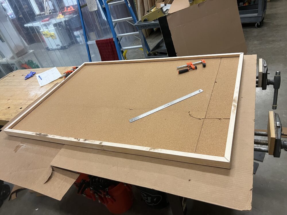
Upcycle Aesthetic: Midcentury Modern.
The midcentury modern aesthetic is most commonly associated with interior design, so I think building a frame for wall art lends itself naturally to this aesthetic. Sarah Lyon from The Spruce, an interior design website, says that the midcentury modern (or MCM) is “defined by simple, functional, and wooden furniture” [7]. This is the main aesthetic I am trying to achieve.
MCM’s simple and functional wooden furniture often adds visual interest through incorporating curves and organic shapes, or using mixed materials. The focus on functionality, rejection of overly-ornate detailing, and use of the map to add a pop of color also aligns with the aesthetic.
Opposite Aesthetic Exploration: Rococo
Where the midcentury modern aesthetic is characterized by simplicity, clean curves, and lack of embellishments, the rococo aesthetic values much different things. According to Britannica.com the rococo style “is characterized by lightness, elegance, and an exuberant use of curving natural forms in ornamentation” [1]. While both styles value natural forms, rococo includes curvier lines and much more decorative elements, with flashy materials and ornate details.
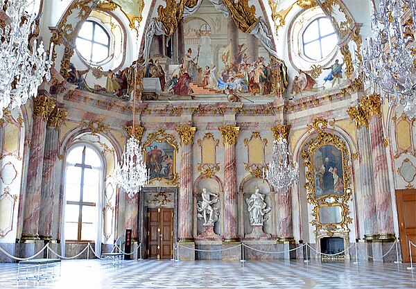
One can imagine what my poster bulletin board would look like by examining framing and other interior decorations from the era that rococo was popular: 18th century, particularly in Europe.
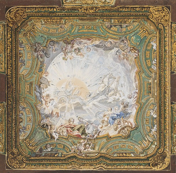
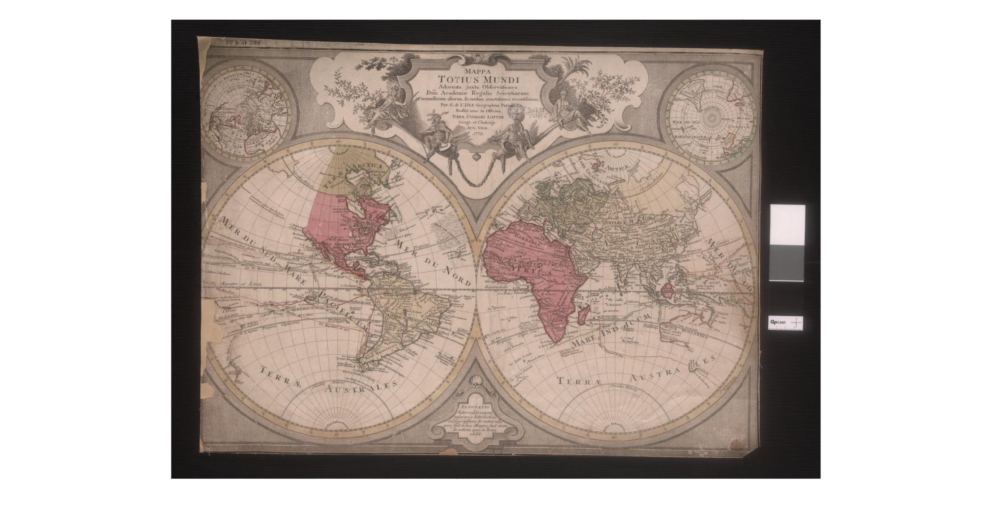
To achieve this aesthetic I would aim to create an ornate golden frame that featured interlocking ovals, many layers of concentric and curvy outlining, and figures that represented exploration like noble sailors or mermaid (given that it is framing a map). I am inspired by the ceiling of church of Santi Giovanni e Paolo in Venice, by Piazzetta, featured in the image below. The focus is still on the framed picture, but the frame itself it still incredibly detailed. The map I plan to use does not fit this aesthetic at all–a frame this ornate would need to house a map in the cartography styles of the 18th century. It would be interesting to include a map from the 18th century, with their different political boundaries and world powers.
I think achieving this aesthetic would be very difficult, especially in the context of upcycling. Perhaps I would have to carve some remnant wood with those ornate details or use plaster to sculpt them. I could paint some old Barbies gold to match the angelic figures from the inspiration pictures I chose. Though I do find the rococo aesthetic beautiful, it does not fit my interior design style.
References:
2 Comments. Leave new
hey Katie, I enjoyed reading about your project and think it’s a fun idea. I think that a Rococo aesthetic for a bulletin board would be another really cool project to do. I think that the pops of color would be perfect for your aesthetic.
Katie I think this aesthetic is really cool. I think that the aesthetic you have chosen is really cool. The gold and thin crowded lines that make up this aesthetic are really cool and will fit well with the map Idea you are producing. Good post!