
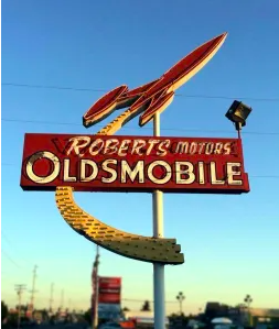
My Upcyle project goal was to create a sign from aluminum cans, inspired by the Googie architectural style during the Atomic age. The main aspects I chose to focus on were themes of space, and the “starburst” design feature. Googie is a term that I had not encountered before this project. It refers to the futuristic design and arcitecture popular between 1945 and the early 1970s. Googie has themes and influences based around planes, car culture, space travel, and the Atomic Age. The Atomic Age (in design) is the time period from 1940-1963, when design was heavily influenced by nuclear weaponry and concerns of nuclear war. This corresponds with the beginning of the Space Age which began after the USSR launched Sputnik 1 on October 4th, 1957.

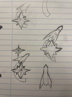
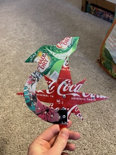
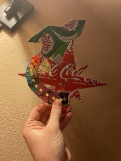
These were the final designs that I landed on, using a prominent starburst and rocket ship I felt captured the signs off the Googie era. I attempted to keep my lines straight on the two features, outside of the large swooping tail of the rocket. My plan was then to attach an Arduino to the back of the sign and fasten LED’s that I could individually program to give the rocket the appearance of blasting off.

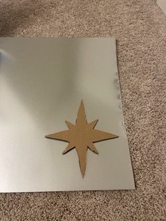
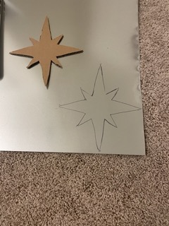
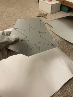

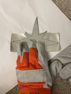
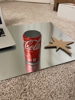
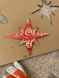
This is the step by step for how I fabricated the base of the starburst on my design. First I sketched a model I was happy with onto a cardboard sheet. Then I used a boxcutter to cut out this shape and trace the design onto a sheet of aluminum ducting that I was going to recycle. This aluminum backing was meant to give stability to the thin soda cans while keeping the signs low profile that I was aiming for.
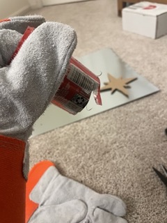
The next steps involved removing the tops of the soda cans and trimming them into sheets with scissors. This wound up being much more difficult than I initially expected, and it took a few cans of practice to get into a good rhythm with this process. After completing this method I also cut out the base of the rocket portion.
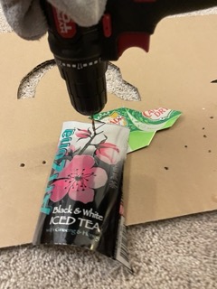
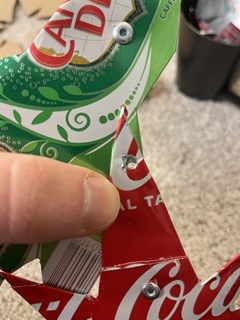
After cutting the soda cans flat. I held them on top of my aluminum base and drilled a hole through both. I put steel rivets through the can and base to fasten them. I chose rivets because I already had some, so there would be no additional cost for this project, and because I did not trust the stability of glueing metals together. After attaching the soda cans I began the process of trimming them down until there was 1/4-1/2 inch of overflow. I then folded these portions back to give the metal a smooth edge, and to avoid cutting myself with sharp metal ends pointing out.
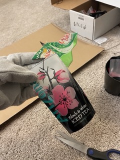
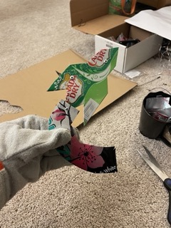

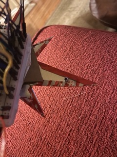
This is a step by step of how I trimmed down the cans. Hole, rivet, trim, and fold. In addition the final photo shows the backside of the sign where you can see the riven poking through, and that folded overflow of the soda can. After this I drilled holes into the top bottom and left points of my starburst and riveted the rocket and starburst together.
I had a slight miscalculation and misaligned the second hole after already riveting the first two, but luckily I was able to drill it out bigger and did not have other issues with this. I intentionally placed the tail of the rocket in front of the starburst, and the rocket itself behind. This was to give a depth to the sign, and by having the tail on the front it would be easier to align my LEDs. After connecting the two I used a fine point sharpie to mark my drill holes for my LED’s. These points were spaced on a few factors. I wanted to start my LEDs close together, but have them separate as they moved down the tail to give that liftoff effect. From experimenting separately with my Arduino unit I knew I could only power 2 LEDs in a series circuit, and I only had 13 digital ports that I could individually control the LEDs with.
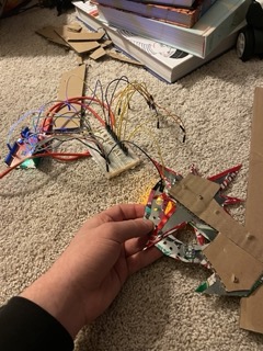
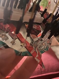
This is an image of how I implemented these electronics into the sign. First i setup all of the wires and LED’s separately, so that if I encountered any errors I knew they happened during implementation. To attach the LED’s I placed the leads through a pre-drilled hole and hot glued them onto the back. I did this in this way so that the fastening would not be visible on the front of the sign, giving it a “cleaner” look, and so that all the LED’s would be at an equal height after fastening.
This video is the electronics separate from the sign but programmed and moving. This was done with simple Arduino code, just small intervals between turning the lights on and then off again. To secure the breadboard and microcontroller to the sign I cut out and hot glued sections of cardboard onto the back of the sign to give a flat base. I then used tape to secure the Arduino, in case I would like to use it for another project in the future.
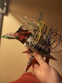
Functionally there were three main issues that I had with this sign. Firstly I wish that I had made the sign bigger. I think it would have looked much cooler, and in some aspects it would have been easier to manufacture. My main limiting factor with size is that I wanted to keep the LED’s closer together and with an Arduino I can only control so much. That leads into my second functional issue which was the implementation of the electronics. By passing the leads through the aluminum sign it was constantly shorting, and individual bulbs would flicker, or just not respond how I wanted them to. If I redid this project I would provide more insulation between the LED’s and sign, or I would install the LED’s in a different way so the leads did not go near the sign. Finally, for a sign this ended up with a huge profile. I really have no way to mount this like a standard sign because the wires on the back take up so much room. This is a problem I was unable to fix, but plan to on my own time. I will cut down the LED leads, and cut, strip, and solder the wires to make the sign much thinner. I would also consider trying to manufacture a custom PCB for the electronics. Either of these would allow me to put a reasonably sized hook, nail, or some other form of wall mounting much easier than I can now.
Artistically I was happy with my design. I like the combination of the starburst and rockets and think that on paper it looks very nice. However in my opinion it became to cluttered with the mismatching can designs. I enjoy the individual aspects, such as the Coca Cola starburst. But all together I find it messy. If I redid this project I would have better planned out what designs/colors I wanted to incorporate and made sure those were more compatible.
I am planning on keeping this project as a learning experience. I know i’ve been critical of it but I don’t hate the final result and learned a lot of valuable lessons from it. When I have some free time later in the semester or over the summer I am going to come back to this and try to take these lesson and better the sign. Change the colors, and slimming down the electronics are my main goals. Then I would like to upscale this design, or a similar one to something more of a street sign size, a few feet in height that I can be more proud of.
Image Credit:
[1] Credit to Ben Faltinowski. https://greatgalacticspacegimmick.com/2017/06/05/the-space-age-craze-coming-soon-a-space-themed-business-sign-gallery/ [2] “Welcome to Vegas” by User Pcb21, https://commons.wikimedia.org/wiki/File:Welcome_to_vegas.jpgAny other videos and images are my own.
Sources:
https://en.wikipedia.org/wiki/Googie_architecture
https://en.wikipedia.org/wiki/Atomic_Age_(design)
https://en.wikipedia.org/wiki/Space_Age
3 Comments. Leave new
[…] If you would like to see more of my 1950’s sign check it our here: https://www.aesdes.org/2024/02/21/led-googie-sign/ […]
This turned out great! I think it was a great idea to use the printed side of the soda cans as the sign’s front face; it allows you to show bright colors without having to paint, ties in the sodas’ branding to the advertisement origins of Googie styling, and fits within the upcycle project. Further, your use of animated LEDs really brings the artifact to life and makes it feel properly space-age. Given that you wish the sign was larger, would you consider using a different material for the flat sections, instead of soda cans, which may not easily cover the entire area of one section?
Brandon, this looks really good. I think you absolutely nailed the aesthetic you were going for – I think if you showed me your project without telling me what the intended aesthetic was, I would still connect it to that style of architecture. And I’m impressed by your implementation of electronics, especially the way you manage to create a sense of motion/animation with the lights that adds to the ‘story’ of the design. I do agree that ultimately the metal can designs turn out a bit cluttered in the final product, but I think the broader colors of the cans you used fit the aesthetic and would have worked well together if the cans weren’t so visually busy. If you were to tackle this again, how do you think you would get around that issue? Would you try painting the cans, finding a different source of metal, or something else?