
Post 8: Final Project Design Preview Report
Introduction
Hi everyone! I’m so excited to share with you my Design Preview Report for the final project.
A couple of weeks ago, as I began to brainstorm for this project, I felt very lost. Being a CTD major, I have a lot of background in terms of fabrication: in my arsenal of skills, I could woodwork, 3D print, draw, sew, et. cetera.
Having so many options at my disposal, I struggled to lock down one singular idea. So, as I often do, I headed to Pinterest and began surfing. I typed out “graphic design outputs” into the search bar and saw one idea that stuck out to me: a visually-succinct booklet that is centered around one topic. Knowing then that I wanted to create a booklet for this project, I began the phases of visualizing and planning.
My Vision
Most of my original concepting for this booklet involved music, whether it’s song titles or song lyrics themselves. I loved the idea of working with an artist whom I enjoy listening to, so I’d have a nice physical memento to keep with me as a result of this project.
Eventually, I landed on Taylor Swift’s studio album, Midnights. I feel that Swift’s deep lyricism and vibrant world-building in her most recent album will lend itself well to the outlet of my project. My vision is this: Each page in this booklet will correspond to a song on the album, meaning I’ll have at least 13 page spreads if I don’t include the 9 additional “3 A.M. edition” bonus songs.
As I thought about the booklet’s function, I decided that I want the final product to be a highly polished physical artifact; think a nice, custom-made wedding book with high-quality photos inside, including a cloth cover and thick, glossy pages.
To achieve this look, I will take a lot of care in laying out the designs in Illustrator. I’ll be working in CMYK colors for print, and specify appropriate margins and bleed to ensure good print proportions.
For my design aesthetic, I did some more digging on Minimalism and landed on a subset of the aesthetic, which is known as Duotone Minimalism. Duotone minimalism uses (as the name implies) two colors for the entire design. Also, other elements like font and imagery must be minimal. I think this aesthetic will help the book employ a succinct visual identity, as well as challenge me as a designer. In most of my designs, I love using a lot of visual elements and bright colors. I feel that “boxing” myself in will both challenge me and help me grow in getting my ideas across more powerfully and simply.
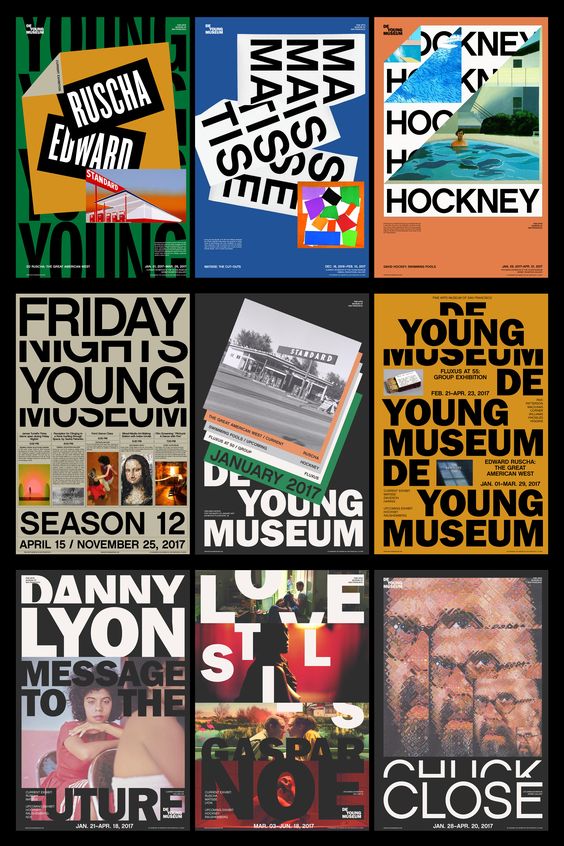
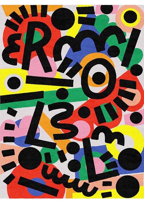
To help get my point across, here are some images from my Pinterest search spree.
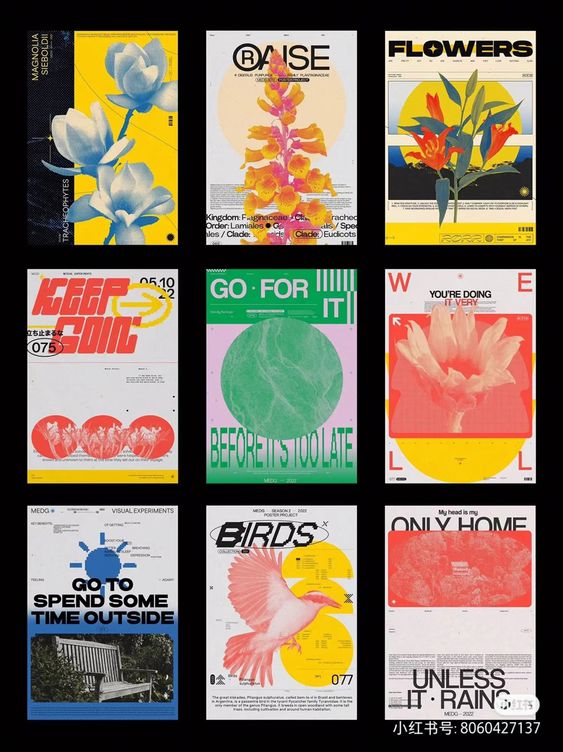
An example of a cohesive booklet design – Pinterest
Another example of a cohesive booklet design – Pinterest
An example of a song title page – Etsy
Another example of a song title page – Pinterest
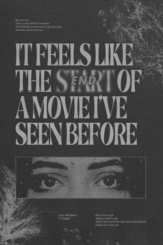
Another example of a song title page – Pinterest
Another example of a song title page – Pinterest
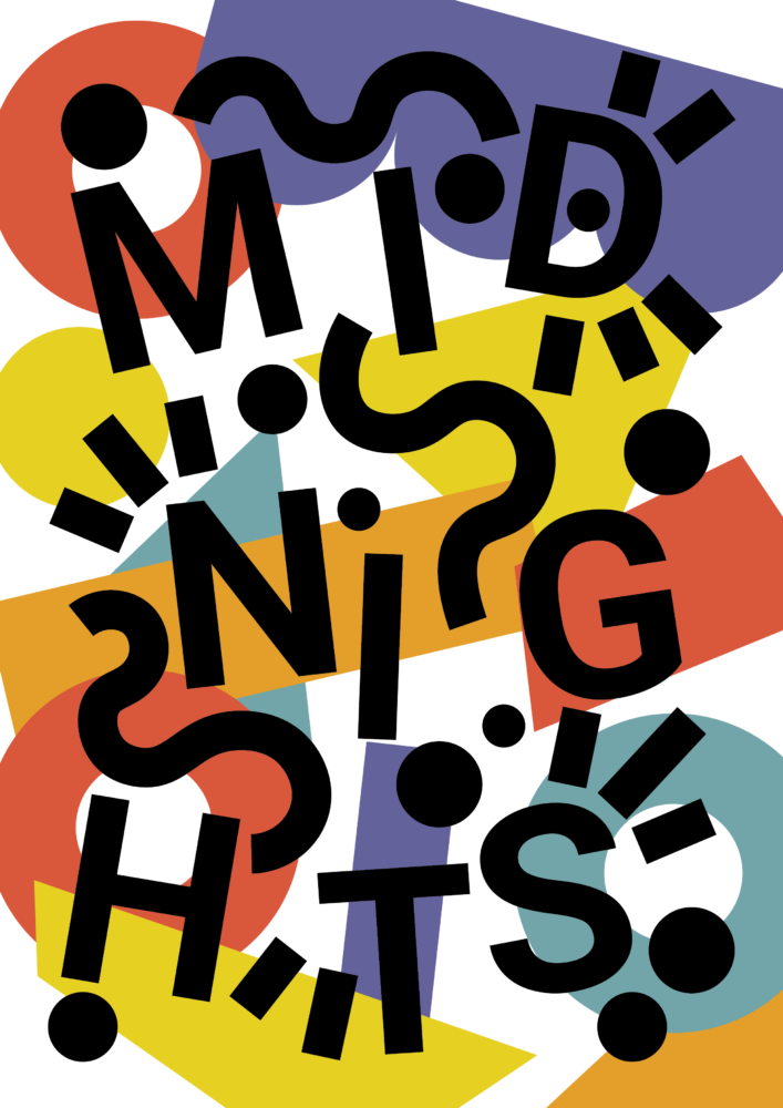
Exploring an Alternate Aesthetic
To further my study on minimalism versus maximalism, and to see my booklet from two differing viewpoints, I decided to challenge myself to make two different book covers that adhere to each design. For both covers, I used an already-existing graphic as a starting to work off of, and to observe the “rules” of each design method. I worked in Adobe Illustrator. Here’s how it went!
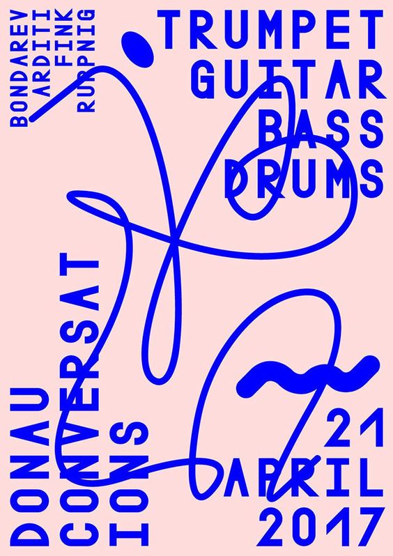
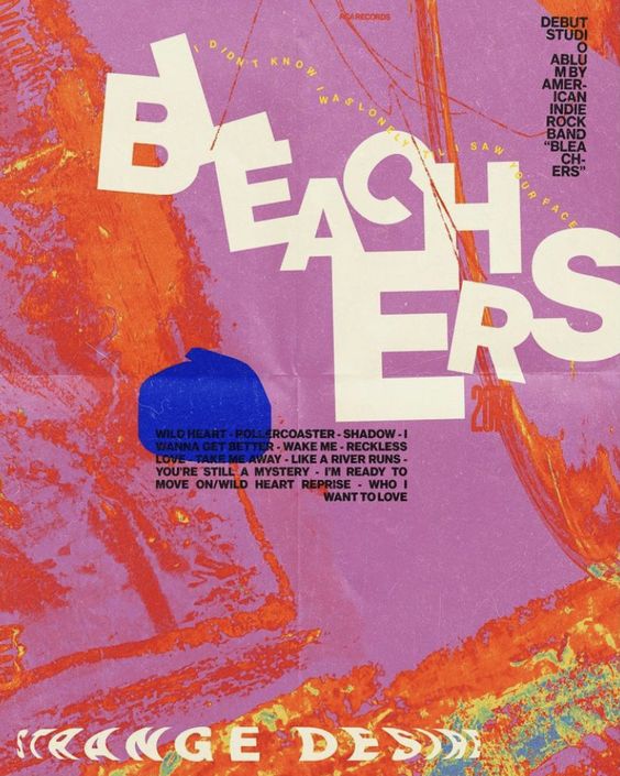
Original Design (Minimalist, Duotone) – Pinterest
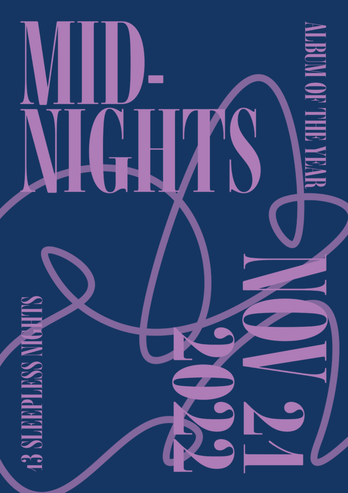
My Design
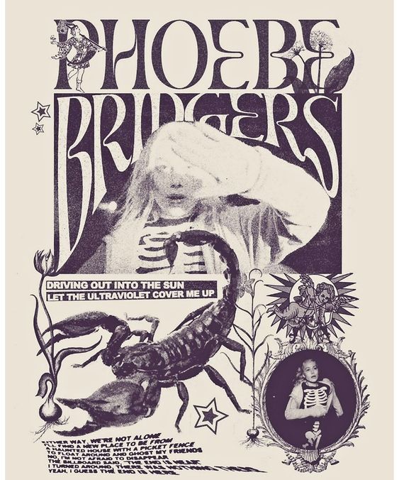
Original Design (Maximalist) – Caroline Dowsett
My Design
Performing this miniature “design study” helped me to better intrinsically understand the design elements that go into minimalism and maximalism, and how they differ from each other.
As I move into the next stages of my final project, I can foresee myself struggling with adhering to the rules of minimalist duotone design. However, I’m ready to tackle this challenge and create a finished product that I’m proud of!
Fabrication To-Date
To date, I’ve done some storyboarding, as well as researched how to print out the pages as a physical booklet.
Staples is a cost-effective option for booklet print-outs; they offer high-quality pages and binding.
As for the booklet layout, here is my rough outline for the page setup. The pages are vertical A4s.

Planning Ahead
To help my productivity, I created a timeline of small goals to reach up until the due date of the project. While this doesn’t have to be a rigid schedule, I think it will be useful to have checkpoints so I’m staying on-time and leaving room for “error” with this big project.
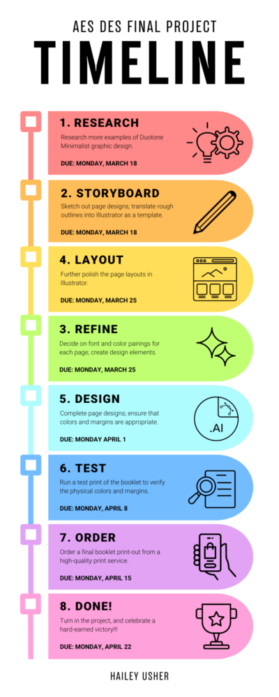 According to my timeline diagram, these are the steps I think the design process of my booklet will require:
- Research more examples of Duotone Minimalist graphic design.
- Sketch out page designs; translate rough outlines into Illustrator as a template.
- Further polish the page layouts in Illustrator.
- Decide on font and color pairings for each page; create design elements.
- Complete page designs; ensure that colors and margins are appropriate.
- Run a test print of the booklet to verify the physical colors and margins.
- Order a final booklet print-out from a high-quality print service.
- Turn in the project, and celebrate my victory!
As for this project’s skills, these are the skills I feel are needed and whether I possess the skill yet or not:
- Online exploration (for inspiration) – yes
- Art (for sketching/storyboarding) – yes
- Graphic design – yes
- Minimalist design – kind of
- Layout design – yes
- Printing – no
I anticipate the printing process to be a struggle/learning curve for me; I hadn’t ever tried to print out a high-quality booklet of this size, so that’s why I’m giving myself extra time to complete this task in my project timeline.
Moving Forward
I’m super happy with my journey so far in this project, and I’m excited to move forward with my plans! As I continue to put together my designs, I’m open to any feedback and suggestions, so please let me know your thoughts! I’ll keep you updated on my progress!
2 Comments. Leave new
I love how well thought out this is and detailed. The timeline is definitely a great choice in keeping you in line.
Your Design Preview Report is incredibly detailed and well-thought-out! It’s clear that you’ve put a lot of thought into your project, from the initial brainstorming to the final design aesthetic. Your choice of creating a booklet based on Taylor Swift’s “Midnights” album is inspired, and your plan to use minimalist duotone design is both challenging and exciting.