

Blog Post 10
Album Booklet: Progress
Introduction
Hi everyone! I’m excited to share and document my progress on the Midnights booklet. Specifically, in the past two weeks, I’ve made a lot of headway in creating my page layouts in Illustrator. I’ve also massively improved my ability to create duotone images in Photoshop.
Creating Duotone Images
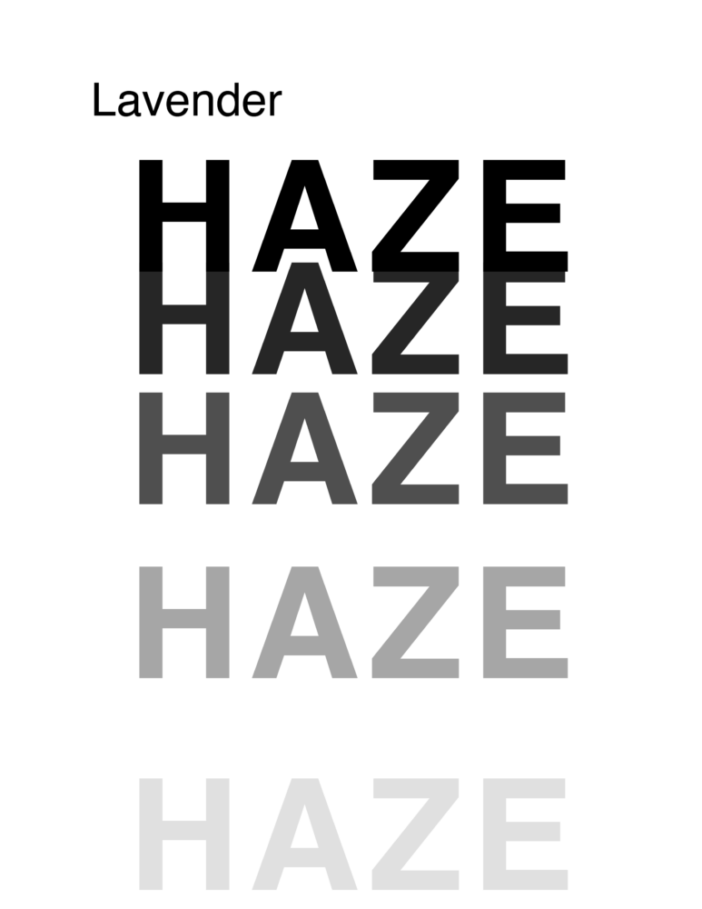
As mentioned above, I started my project by first learning how to create duotone images in Photoshop. In doing so, I decided to work on the first page/song, “Lavender Haze.” I picked out a still image from Taylor Swift’s music video and imported it into Photoshop. Upon doing so, I quickly realized that the image didn’t fully match the Letter dimensions of the booklet. So, I decided to use a new feature in Photoshop to resize my image–Generative AI–which worked well!
For my duotone recoloring, I figured out a process that worked well within Photoshop for creating this effect: Gradient Map. Using this tool, I could specify the colors of the entire image, limiting them to just two hues of my choosing. During this process, I realized I needed to be careful of the colors I chose for my gradient mapping; they both needed to be within the CMYK gamut for printing purposes.
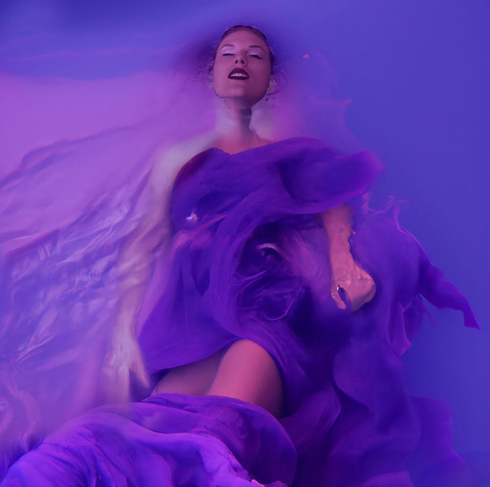
Original image from Taylor Swift’s music video
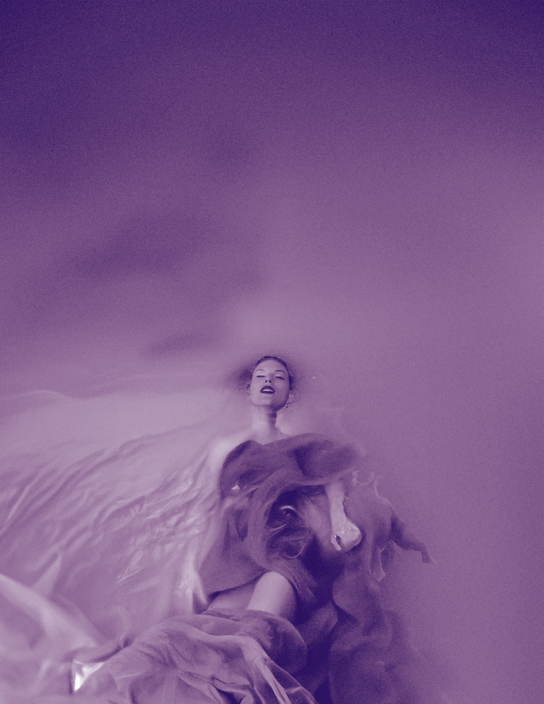
First Duotone attempt using Gradient Map
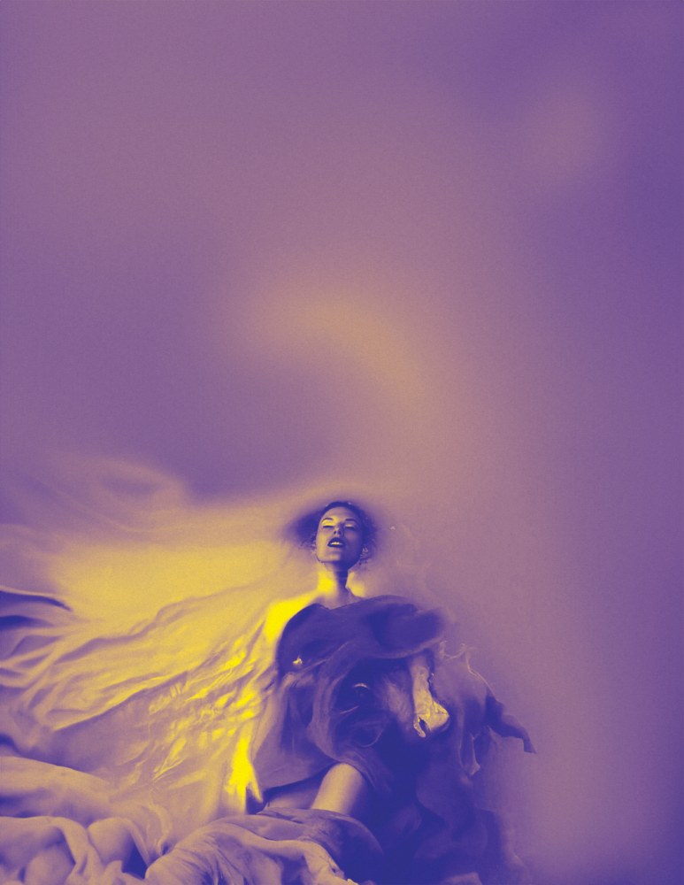
Second Duotone attempt using Gradient Map
Figuring Out Layouts
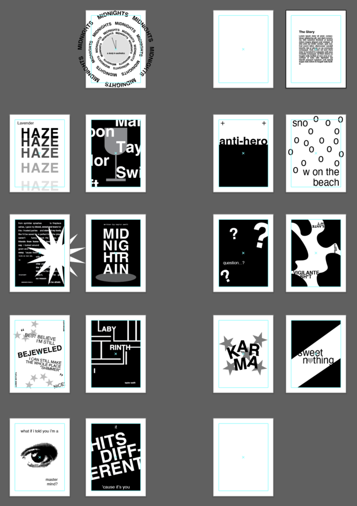
In Illustrator, my first step was to create the pages and margins for my booklet. I opened a new 16-page file and specified the size as “Letter” for printing. Then, I added .75-inch margins to each page for consistency.
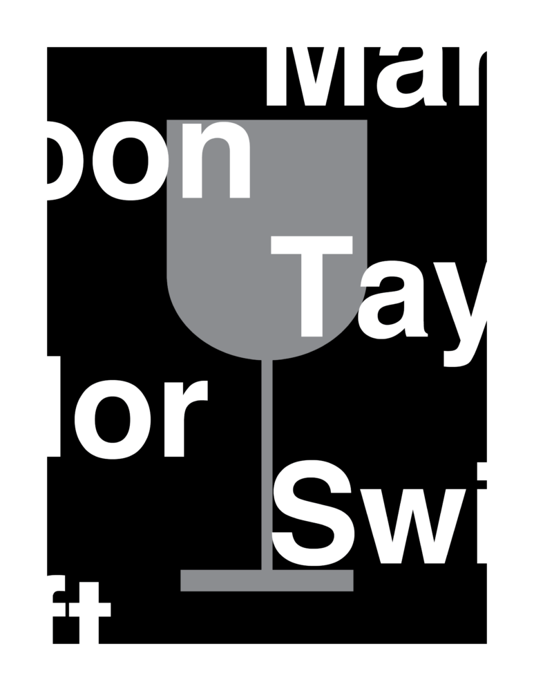
Once I had my file set up, I switched gears and focused on creating the design for “Lavender Haze.” I started by importing my Photoshop Duotone image and then considered the text portion of the design. In doing so, I quickly found myself stuck. I had spent hours picking the perfect font, messing with the text layout, and switching around the colors. At this point, I knew this workflow wouldn’t be effective for the entire booklet.
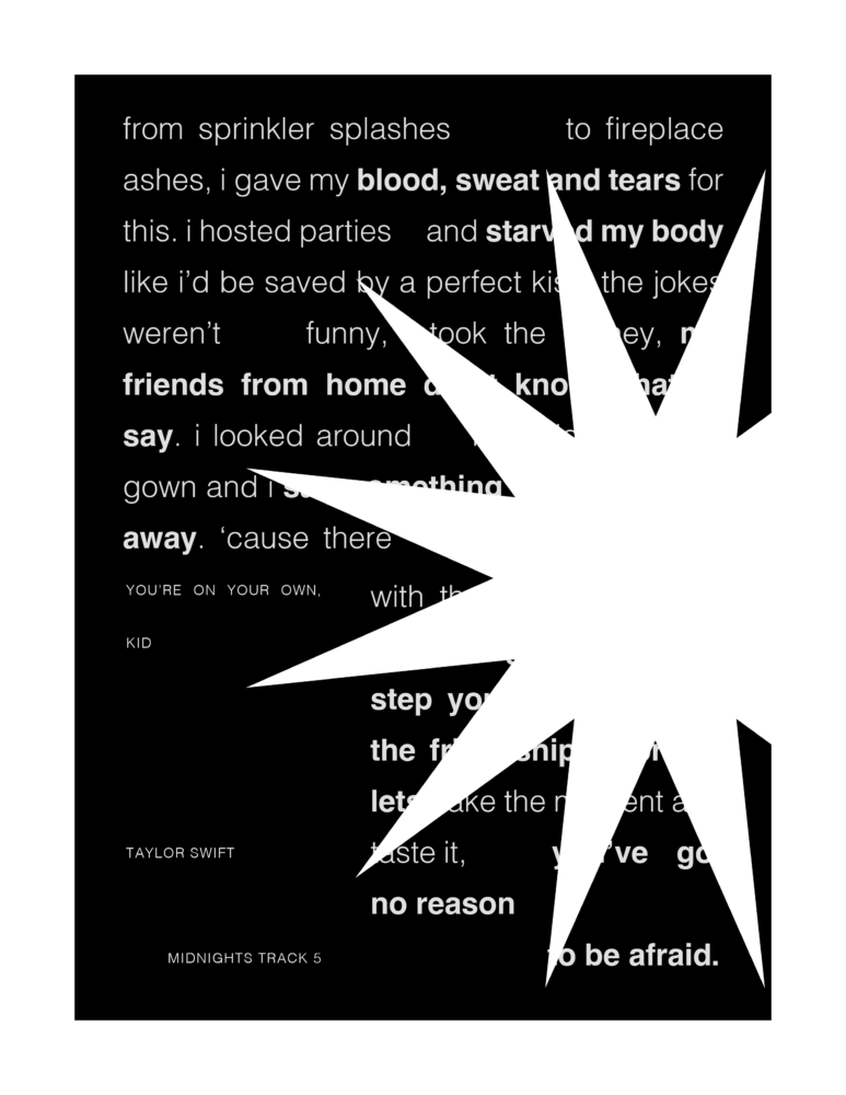
I decided to scrap the image and layout I’d created for “Lavender Haze” and start from scratch in a blank Illustrator file. Instead of focusing on one page, I considered the entire booklet. I further limited myself by working in strictly black and white, as well as Helvetica, the simplest font.
For the next few hours, I focused on laying out the basic color values and text on each page. Throughout the process, I zoomed out on my booklet to ensure my designs shared a similar visual identity.
When I was finished, I created a layout for each page that I could build up with colors, a custom font, and additional graphics.
Looking back, I’m glad I stopped and pivoted when I realized my workflow wasn’t serving me. I feel much more confident moving forward with my design process!
Looking Forward
Moving forward, I plan to focus on one page at a time, this time knowing my overall layouts are consistent. However, I should “pause: frequently to re-evaluate my design style.
I realize I’m off-track from my original project timeline, but that speaks to the change I had to make to my design process. I’m confident that moving forward, my workflow will be much quicker.
Ultimately, I plan to finish my designs in the next two weeks to ensure enough time for the booklet to be printed via Staples.
I’m excited to continue updating you all on my process! I hope you enjoyed reading about my struggles and problem-solving process!
2 Comments. Leave new
It’s great to hear about your progress on the Midnights booklet! Your dedication to improving your skills in Illustrator and Photoshop is evident, and it’s inspiring to see how you’ve tackled challenges like resizing images and mastering duotone effects. Your willingness to adapt your workflow for better results shows a thoughtful approach to your design process.
Hi Hailey,
Making an image album book sounds really cool. I’m not sure if you have answered this in another post but do you have any challenges you have encountered during your process?