
The Minimalist Cupholder
While I have covered this in some of my other posts, I think it would be a good idea to talk about the motivation behind the project that I have been working on. As of now, the cupholder on my desk is a warranty booklet for a Seagate hard drive. It’s literally a small book that you usually flip through to see if there are any stickers inside. While I could have easily gotten any kind of cupholder and solved my problem, I found a problem similar to this one:
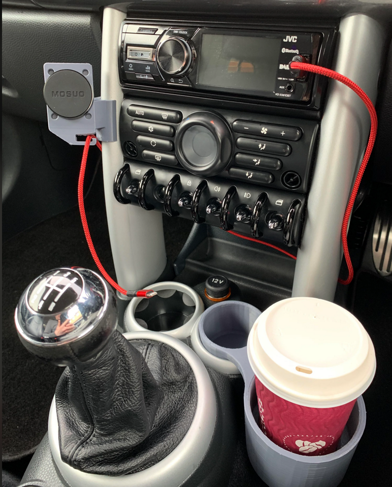
This kind of design really pisses me off. Why, in all that is holy, can a regular coffee cup not fit into the cup holder of a car that made it to production? It irritates me like nothing else. I wanted to design something that would allow for a cup to fit inside of it and feel as though it was made for that cupholder.
Aesthetics Inspirations
Throughout this course, I have taken a lot of inspiration from the likes of the Bauhaus movement as well as Dieter Rams and the industrial design group at Apple, specifically under Jony Ive. An example of this that I believe really captures this aesthetic is the design of the stair railings at Apple Park:
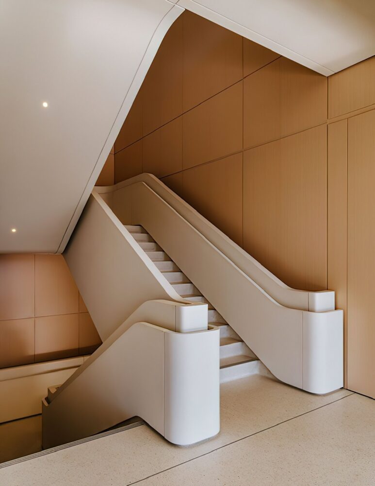
I absolutely love how curvy these stairs are, and really wanted to try and challenge myself to create something that is minimalist while at the same time being functional and containing a lot of organic curvature. The curvature, to me, feels organic in a way that is refreshing from a life that (especially for an engineering student) is filled of right angles, harsh environments (looking at you, engineering center designers), and human manufacture. I think organic shapes are grounding and a pleasing contrast to our everyday experiences.
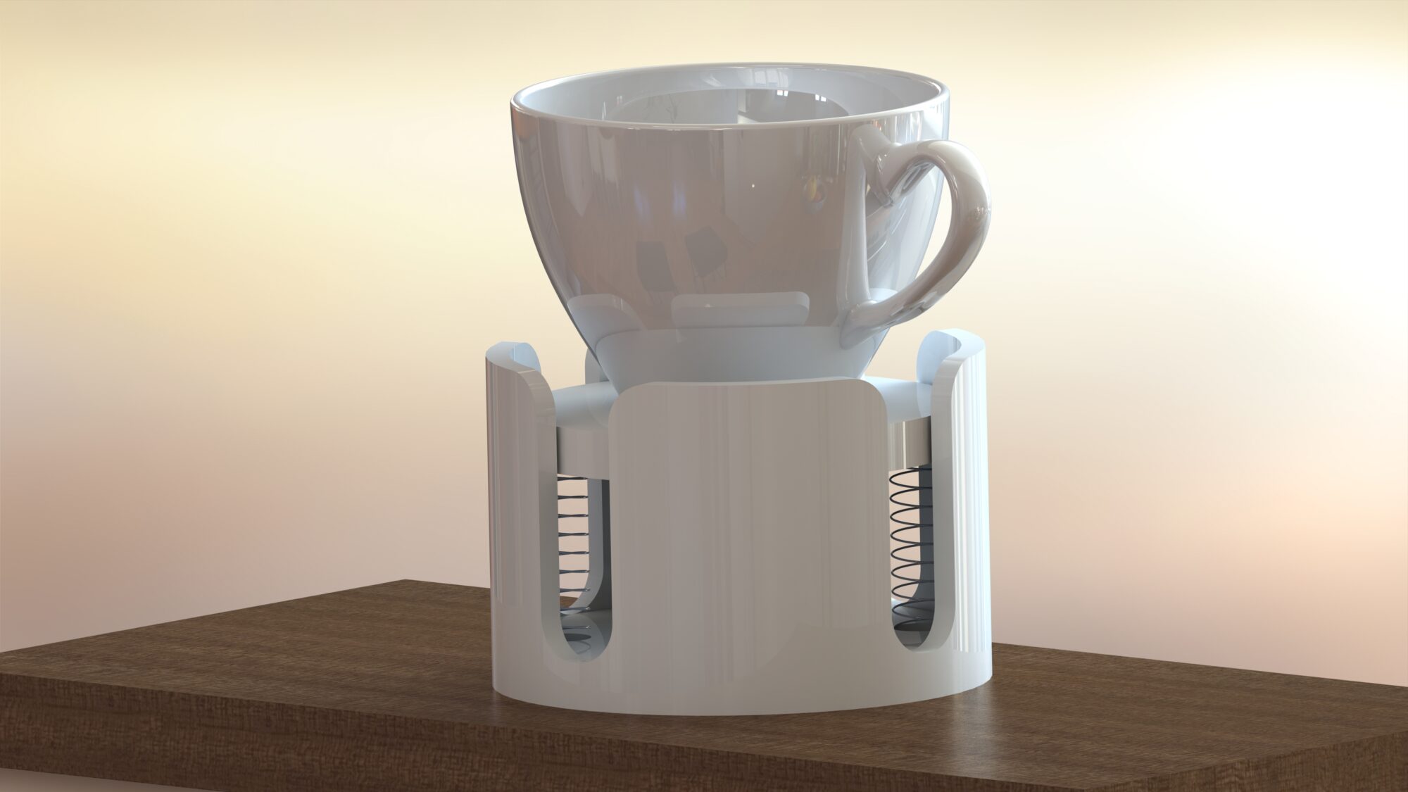
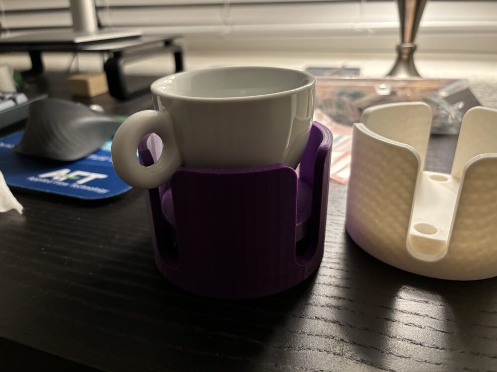
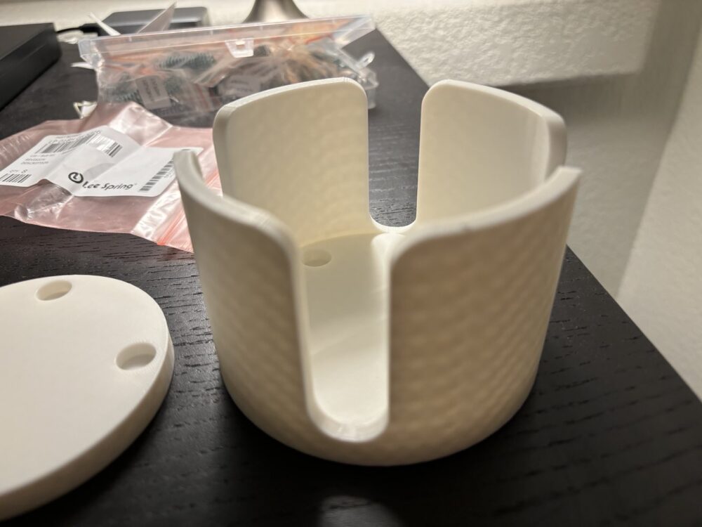
Final Renders

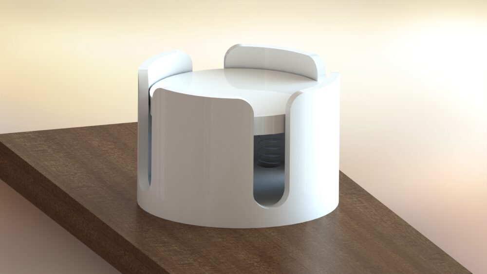
The details of my design will be talked about in much greater detail in the following post (it had to be completely redesigned), but I believe that I have made something that I am proud of. The springs on the bottom of the artifact allow for the mug to be filled with water entirely (I did the math for spring constants for various mugs I own filled with water) and to slot into any of the four slots on the perimeter of the artifact. The white color was chosen so that I can place it on my black desk and see the stark contrast out of the corner of my eye without needing to take away my vision. The ergonomics were also something I gave a lot of thought to; the filleted edges on the top are for aesthetic reasons (organic shapes), however they do provide a bit of tactile feedback, guiding the handle of the mug I’m using into the slot without me needing to look directly at the artifact to align the mug properly, one of the main design goals I had for this project.
Final Assembly

4 Comments. Leave new
Josh,
I really like how your project turned out. I am wondering what the motivation behind using springs was. Was it to hit the required dynamic design? Additionally, did you do any calculations to choose the springs used? Anyway, you did a great job capturing the minimalist aesthetic and bringing your idea to life.
Hey Oliver,
The springs were mainly to satisfy the dynamic aspect of the design, you got it. And yep, I did do a bunch of math to calculate the spring dimensions using the Component Design textbook and equations from there.
Hey Josh,
Cool project, I have never really heard of a standalone cupholder. Can you explain a bit more your thought process behind this, like where the need comes from? Regardless, it looks well executed!
Hey Chris,
The need mostly comes from me not currently having a cupholder that I like that fits multiple mugs. Most of the cupholders I’ve used only fit one kind of mug, and that irritated me. So I wanted to try and create a design that solves that issue.
Thanks for the compliment!