

I chose the 1950’s Signage aesthetic for my upcycle project using mostly scrap aluminum and plywood. This aesthetic was brought to my attention by Brandon Pillips’ post 1 on the aesthetic, and I don’t mean to rip him off but I liked the vibe and wanted to emulate it myself. The dilapidated signs I see on road trips bring a certain feeling of nostalgia, which is interesting considering I was not born early enough to see these signs in their prime. I think that the upcycling project is perfect to capture this aesthetic, as reused materials would exemplify the way the signs have deteriorated over time. The use of mostly aluminum cans shows off bright colors that pop and shine the same way. I wanted to create something like the stardust motel sign specifically since it exemplifies much of the 50’s aesthetic and has features that make it 3-Dimensional and more dynamic. The main features of this aesthetic that I want to point out with this project are the bright colors, starburst designs, geometric shapes, and loud fonts.

[1] Stardust Motel Print – Ed Kiley
I wanted to challenge myself with this project by making a large model that would take some time and effort to create, and make something that can replace the Christmas tree that’s still sitting in the corner of my living room. I started by sourcing my aluminum cans from the CU Recycling Center since they were gracious enough to let me dumpster dive. I took mostly Coke, Pepsi, and Modelo cans to make up the red, white, and blue shown on the sign, with a few random cans that match the colors closely enough to supplement if need be. I filled two garbage bags and took them home to open and clean.
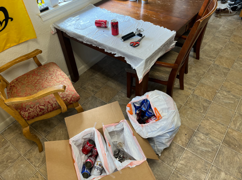
[2][3] My can-cutting / cleaning station
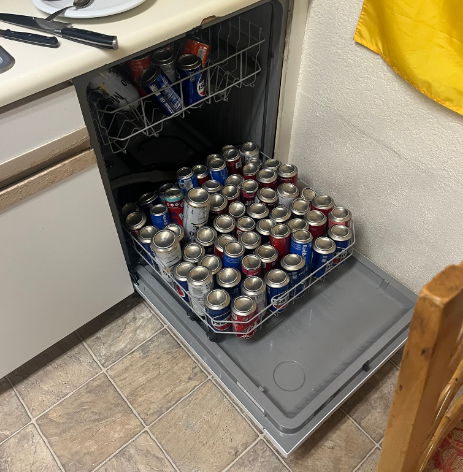
I cut open every can individually using two can openers (I managed to break one from overuse) such that I could wash them in my dishwasher to get rid of as much trash juice as possible. This gave me a good starting point to start cutting out the primary colors I wanted to use for my design.
[4] All of my washed cans sorted by color and ready to be cut
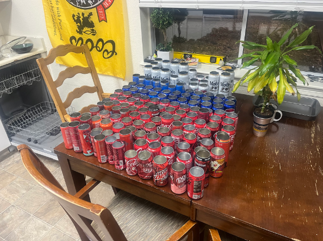
I then took one can from each color and cut out only the parts that I wanted to use so that I could measure the surface areas. I used this surface area to determine the scale I could make the plywood skeleton for my sign. My mistake here is that I should have first created my design before going to get the cans so that I could anticipate the proper ratio of cans to get such that I would not have much left over. I did not do this, however, and I was forced to make do with my existing material. Upon creating the model for my plywood structure, I found that I needed 30% blue, 42% red, and 28% white to complete my design. I picked up 20% blue, 57% red, and 23% white cans before this discovery. This meant that my limiting color would be blue since I didn’t feel like dumpster diving again. Using the limiting surface area and referencing the blue sections of my model I was able to scale my 3D model in Solidworks to the proper size to maximize use of the blue, about 3 feet in height and almost 2.5 feet in width.
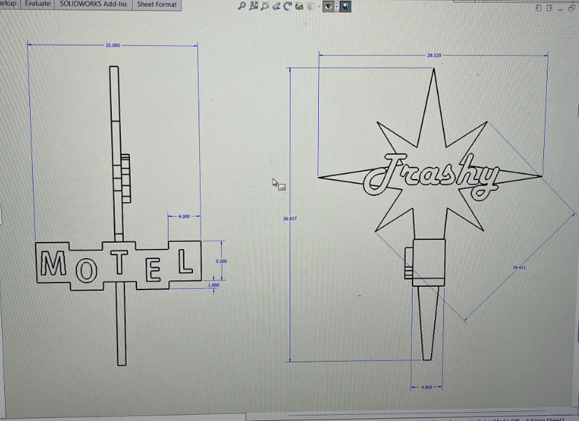
[5] CAD drawing used as reference for the OBS structure
I took to the machine shop in the ITLL, planning to laser engrave the outlines of this model onto OBS, but the cutters wouldn’t fit the necessary size so I had to draw them out by hand. I then did most of the cuts on a bandsaw, which was also difficult due to the size and geometry of the starburst, and brought the pieces home. I screwed all of the pieces together into place before moving on to cutting and gluing aluminum into place.
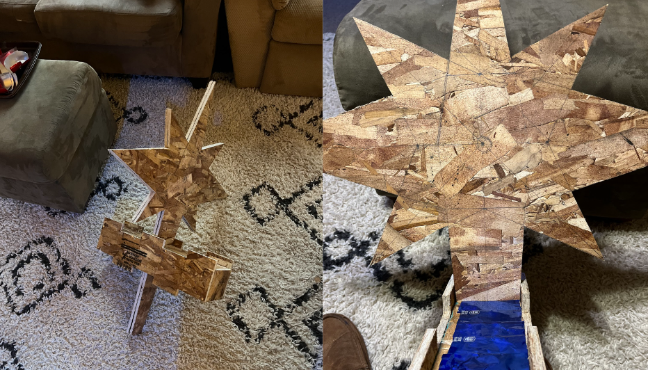
[6] Completed OBS structure
[7] First aluminum glued to OBS
I cut all of the rims and bottoms off of my cans so that they were rolls of aluminum and then cut out just the reds, blues, and whites from each of them. I glued these pieces on after sizing them to match the empty spaces and maximize the surface area. This was far more tedious and time-consuming than I expected, and by the end of it, I had watched the entire first season of “Invasion” on Apple TV from the beginning. The super glue I used had a quick drying time, but it required that I hold the piece in place while it dried otherwise the aluminum would try to curl back up so every piece of aluminum took at least a minute just to place before I could move onto the next one.
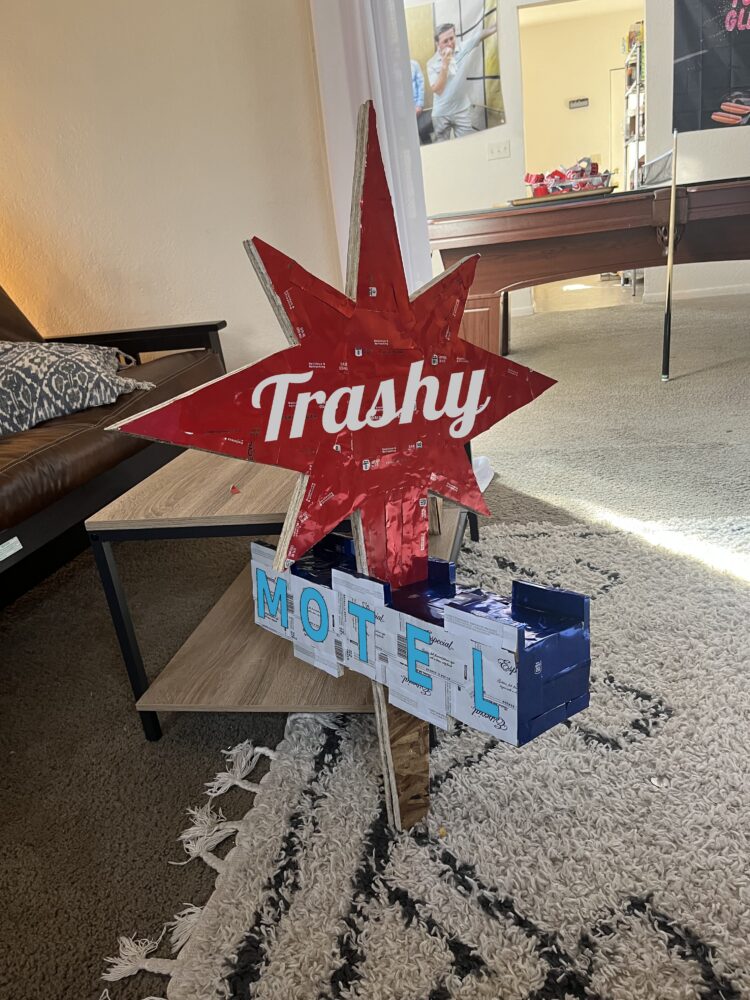
[8] “Finished” Product
As you may have noticed, my project still has some exposed OBS and is lacking a stand. This is mainly because the painstaking process of gluing aluminum took roughly 10 hours to get to just this point, and counting my other manufacturing steps this project took around 20 hours in total. I am determined to make this a piece of work that will be a part of my home, but at this juncture I believe that I have at least captured the aesthetic for the scope of this class. I plan to take some of my free time to contemplate how I want to complete the stand and the rest of the aluminum and complete it to my standards within the next week. Regarding the aesthetic, the aluminum works out just as I had expected it to. It gives a look of shine and flashy-ness that one might expect from a 1950s-style motel sign, and the collage adds a deteriorated vibe that I think is fitting. I think that when it’s done I’ll be content to add this to my home’s decor, and I’m quite happy with where it is currently and where I plan on it being in the near future.
4 Comments. Leave new
Noah, your artifact came out amazing and it is absolutely something to be proud of!!! I love how the cans as a material came out with the metallic pop of color and I think it embodies your aesthetic really well. It was great to hear about your flexibility when trying to cut your project into the OBS and I am so happy that you didn’t sacrifice the scale of it for convenience. This project came out amazing and I hope you finish off the last few touches and get to display it proudly in your home!
Thanks Colton,
I hoped to finish it over the weekend but it’s so difficult to pick it back up right now. Typically when I get something like this done I need to do it all in one sitting so I’ll need to make more time soon. It’s difficult to pick it up for an hour every once in a while, but hopefully soon I’ll have it completed.
Hey Noah, I really liked your artifact! It really demonstrates a commendable effort to capture the essence of 1950s signage through upcycling. The meticulous process you underwent to source materials and craft the aluminum collage is evident in the attention to detail displayed in your finished product. The vibrant colors and dynamic design elements truly evoke the nostalgic charm of mid-century Americana. The unfinished retro looks of it is really cool. What would you choose in alternative to aluminum cans, just out of curiosity?
Thanks, Aryan, I’m glad you liked the project. To answer your question, if I had access to a larger piece of sheet metal that I could color that would have been amazing for my process. It could have just been traced and cut to size, rather than collaged together and overlapped. This isn’t easy to come across though, so for now the cans will have to do.