

Introduction
As you’re probably aware, my final project for this class is a printed booklet full of graphic designs for the album Midnights by Taylor Swift.
Specifications
(1) Aesthetic
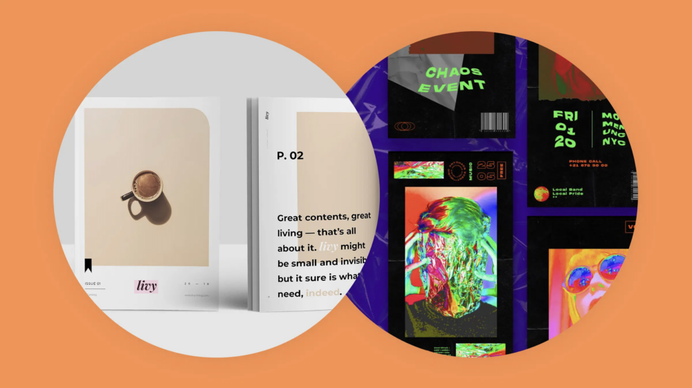
Achieving the minimalist aesthetic is a huge specification for this project. I need to be careful of adding too much of anything (text, color, graphics). I also need to make sure that my overall designs are cohesive.
(2) Color
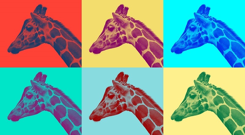
Designing in duotone colors is another major specification for this project, as it’s a part of my aesthetic. That said, I need to choose colors that work well together and are print-friendly.
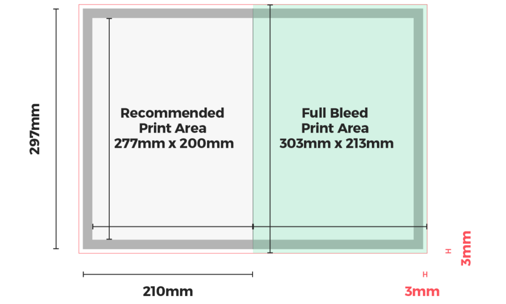
(3) Size
I want the size of my booklet pages to be a vertical A4s. I plan on researching appropriate margins and text sizes for this page. I also need to ensure that Staples will print booklets in A4 sizing.
(4) Flow
I want the designs to all feel unique but flow together dynamically. I plan on achieving this through the use of gradients. Checking the “flow” of my pages throughout the design process will be key in achieving this look.
(5) Vision
I want to succeed in creating “professional-looking” designs. To do this, I’ll follow the general design rules (rule of thirds, etc.) when possible.
Constraints
(1) Color Output
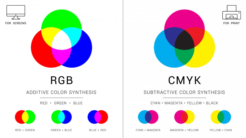
CMYK colors work differently than RBG, as they are “subtractive” and not “additive.” This ultimately means that my print output will be a bit darker than it shows up on my screen. I need to be aware of this in my final print stage.
(2) Print Quality
I’m a little worried that the Staples print quality could be sub-par, affecting my final product quality. To address this issue, I plan on testing the print quality beforehand by running a “test” print of one or two pages of my booklet.
(3) Margins
I need to make sure my margins are correct in the print output. I want to have .5-inch margins on all sides, so I need to ensure that I specify the margins in Illustrator and in my print order to Staples.
(4) Time
Ensuring I get the designs done promptly ahead of the deadline. Designing is something that takes a while for me since I’m very particular and detail-oriented. However, I’m confident that if I stick to my project timeline, I’ll be good ahead of our end-of-year Expo.
(5) Workspace
I can only design on my computer, so it’s more difficult to progress when I’m out and about. Beyond that, designing takes focus, so having a quiet, calm environment is also important to my workflow. I need to plan specific times to commit to sitting down and focusing on this project in Illustrator.
2 Comments. Leave new
Hailey, I like your post! I was not previously aware of the ‘subtractive’ aspect of CYMK, so I found that particularly interesting. I would be interested in seeing any sort of preview of your work you have as I am excited to see the final result. One question I had was what is do you plan on editing the album art used at all, or leaving it be? Exciting!
Hi Hailey, I agree that designing something on a screen for it to be printed is a design challenge and hope you are happy with the printed result. I am also curious to know why you chose to use A4 sized paper and not letter sized which is easier to find.