

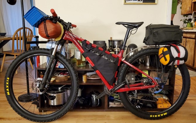
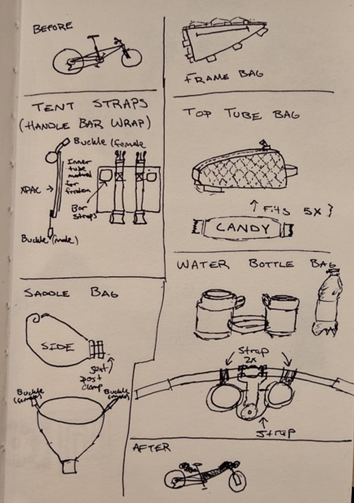
For the final project I was interested in creating the second revision of my bikepacking bag. My inspiration was preparing for the Colorado Trail plans that I made this summer. I hope to ride my bike my Denver to Durango. To do this adventure I will need to carry all my gear on my bike. Hence why I am interested in creating storage solutions for the trip. I had previously designed and built a frame bag for my bike, but the quality of the product wasn’t great. I didn’t do a great job sewing the bag and the zippers were really difficult to operate. In the image below my bike and all the gear I will carry are attached. Note how tight the bag is. The initial design was slightly small for my bike causing the seams of the bag to see unnecessary stress, eventually causing failure. I also was inspired to complete this project by hearing the origins of companies like Black Diamond, Patagonia, Arc’teryx, etc. All these outdoor companies got their starts building products out of their garages because the current market didn’t support what they wanted to create. Additionally, the products they made could be purchased for significantly cheaper than the off the shelf alternatives. I would like to start making my own outdoor gear because I often find I’m not satisfied with the products I own. My designs would allow me to fill all the little niches and requirements I have. Below, I included some initial sketches I made for other potential bags I could start sewing to complete the bike build. I quickly realized I wouldn’t have time to create all these designs, so I am going to focus on the frame bag for this class. The project will be a great exercise in building not only a functional product, but more importantly an aesthetically pleasing one.
The aesthetics of the product will be the primary focus of the bag. There are some lingering functional defects in my first rev that I will address but those are small in comparison. In the image of my original bike bags, you can see the black color way of my bag. I think this color does an excellent job blending in with the aesthetic of the bike. I have this red and black color scheme going on. The bag is very sleek and looks like it belongs. I honestly really like the color combination, but I knew I had to try something new for this project. I didn’t want to create another boring black bag that just blends in. When you look at outdoor gear, specifically skiing/mountaineering there are so many loud colors. Companies like Cotopaxi champion this idea of loud colorful outdoor focused gear. I wanted to push myself and challenge my conventional wisdom regarding the colors of my gear. When you research bike packing bags, the products usually come in three colors: dark green, brown, or black. These are great because they are subtle and blend into the natural environment. However, I didn’t want to spend 25 hours on a product that wasn’t even meant to be looked out. This is a custom bag that I made specifically for my bike. I want the bag to be loud and catch people’s attention. The color choice will be an interesting conversation point along the Colorado Trail.
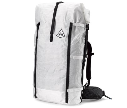
So, I began searching online using unconventional colors like pink, purple, yellow, etc. I found this AI website dopely.top which creates a color palette automatically. I attached the image I pulled from their website below. Initially I was interested in blues, reds, and greens. However, I decided to branch out from my typical favorite colors and select this palette as my baseline color scheme for the design. I didn’t want to make the entire bag from these loud colors though. One company that heavily inspired this project was Hyperlite Mountain Gear. They make some of the best ultralight backpacking gear (see bag image attached below https://www.hyperlitemountaingear.com/pages/ultralight-backpacks). Their bags only come in white or black colorways. Additionally, they utilize the xpac material I was already planning to use in this project. I decided to use white as my primary color to contrast the previous bag I made but also as an homage to their products. So, I have settled on a white primary bag with the accents shown in the dopely.top color palette.

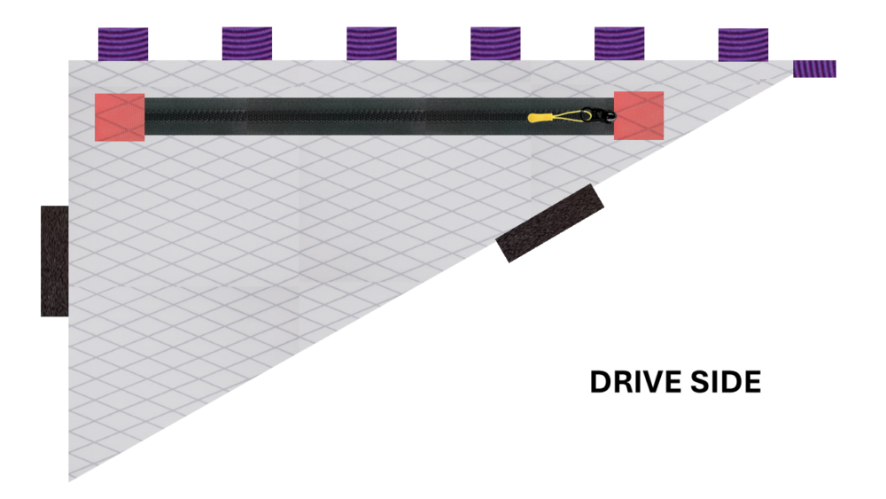
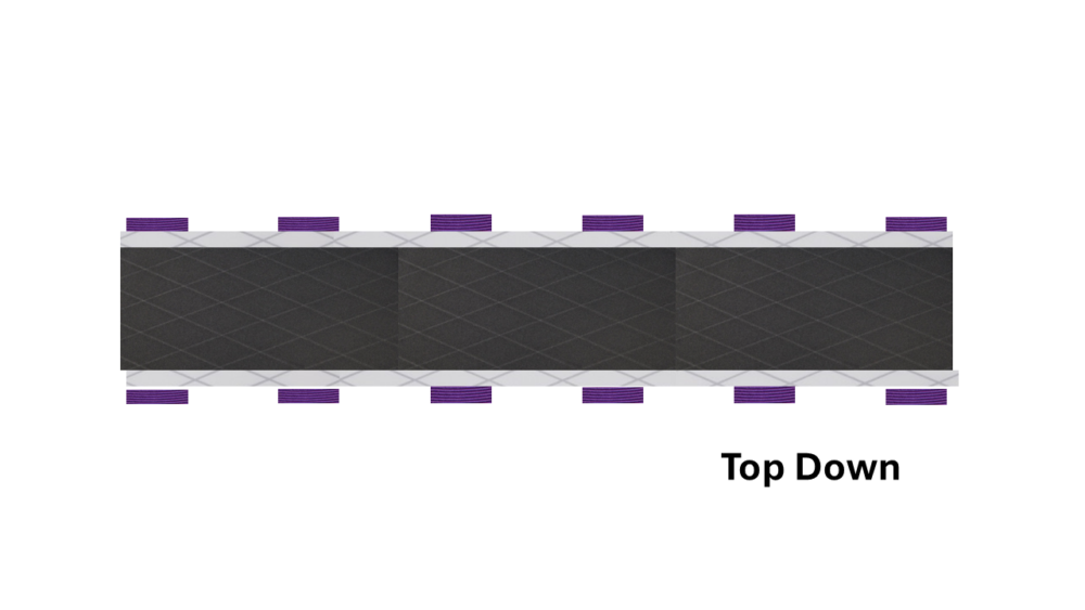
The final touch to my aesthetic was the actual construction of the bag. My aesthetic is outdoor minimalist. This means I utilize as few features as possible while making a very capable and lightweight product. When you go to REI for instance, there will be so many bags with all the bells and whistles. They have a pocket for every piece of gear you could imagine carrying. However, each pocket adds unnecessary weight, just to be a little more organized. Moreover, these bags encourage users to overpack and over prepare for their adventures. Ultralight gear is the opposite of this style. You essentially have a stuff sack with some straps to carry the bag. Any extra bit of material that doesn’t directly affect the user’s ability to carry gear is cut out. The bags feature minimal padding. A single large pocket and a few straps. To follow in this style, I decided to use a single zipper for my bag instead of two. This means my bag is essentially a giant pocket with no organizational features. I prefer this construction because it’s much simpler and therefore more reliable. I also decided to use two Velcro straps and a series of tie off points on the top of my bag. Additionally, I ditched the waterproof zips that I had sewed into the first rev of this bag. I believe the larger molded tooth zips will be much more reliable once they get dirty. At the end of the day, I want this bag to look good while serving a simple purpose.
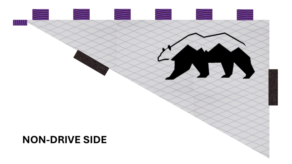
I then started my final renders for my bag. Those three views are attached below. I am very happy with the way the colors came out. I recently sewed the bag and am excited to share the final product. The bear logo on the “non-drive side” is a personal touch to brand my bag. Most outdoor gear feature a logo, and I thought this could be an opportunity to create my own brand. I sketched this bear and then imported it to my computer as a stencil. I decided to cut the logo out of black gear tape that I will stick to the bag. I decided to make the bear much smaller on the final product to make the bag more subtle and minimalist.
2 Comments. Leave new
Hi Blake,
This sounds like a really cool project. I think it kind of interesting that you are going with white as the main color (but if Hyperlite does it it cant be too bad right)? Have a good trip!
Blake, I have been following your project and it is exciting to see it finally come together. I really like what you are accomplishing and I hope you have a great trip from Denver to Durango!