
NeuMouse Final Report Part One
Inspiration
All sources for images not taken by me should be linked directly through the image.
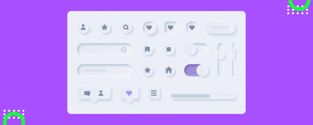
Neumorphism is an aesthetic commonly used in modern UI’s which originates from skeumorphism and glassmorphism. It is characterized by rounded shapes which appear to protrude and fade into a background of a similar shade and color. Typical color schemes contain neon/pastel blues and purples for accents, and a simple black or white for the background (depending on whether it is a light or dark ui setting). Text styling is typically thin and serif-free.
For a general project recap, I have designed a mouse to replace my personal Logitech G502 shown below. I have had this mouse for a very long time now, and the software has stopped working. Additionally, I wanted a mouse with similar customizeability but with a cleaner, more professional aesthetic. I do still want the mouse to pop and be fun though, not simply being a dull grey or black.
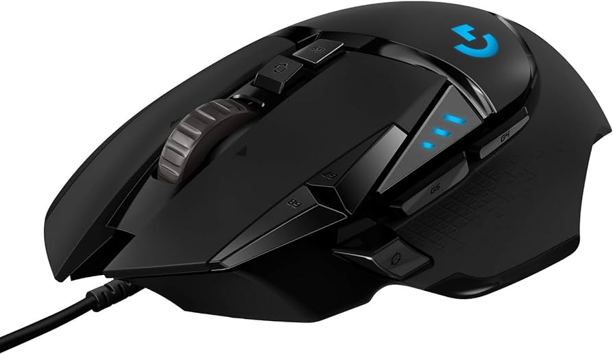
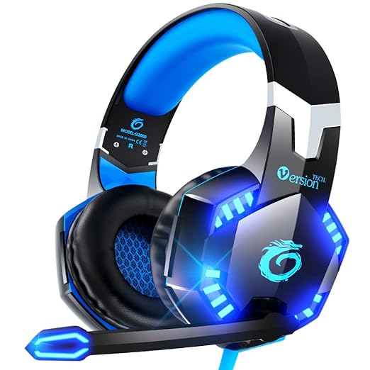
While I like the feel of the mouse in my hand, and the number of programmable buttons it has, I am tired of having to deal with Logitech’s software. I also feel slightly embarrassed whenever I use the mouse in public, due to its ‘epic gamer’ aesthetic, which I will include an image below I feel is representative of what I am talking about.
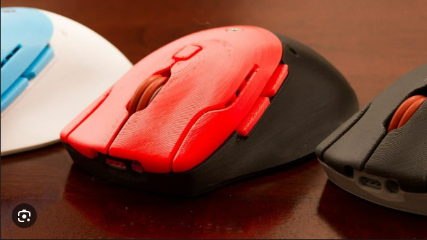
After doing some research, I found many people have made their own 3D printed mice before (examples shown below).
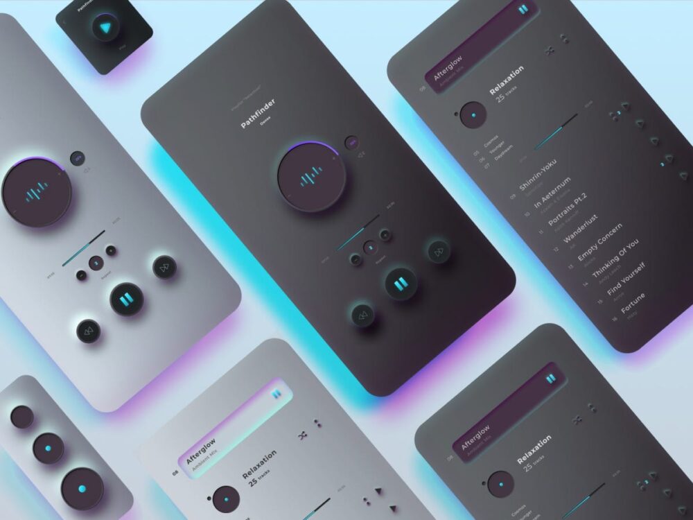
I have designed a mouse in the aesthetic of ‘neumorphic’, a popular tech aesthetic which has become prevalent in recent years. It features soft drop shadows and indent appearances, with either white or black as the primary colors, grey as a secondary, and purple or blue as an accent. Text is typically very thin and elegant in typesetting. Some good examples are shown below.
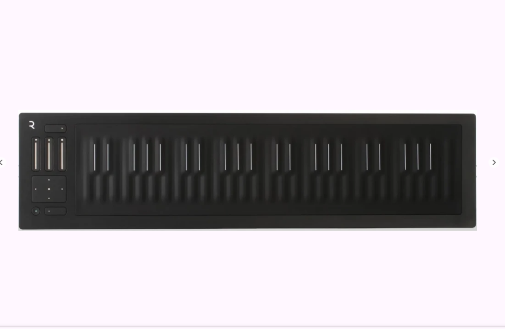
Since neumorphic is an aesthetic commonly utilized in user interfaces, and not physical products, I had to be creative in order to make my project look nice and still relate to the aesthetic I wanted, since it is a physical thing. This was challenging at times, causing many headaches trying to get SolidWorks to behave, but in the end it generated some very nice, interesting looking geometry. One image which I continuously referenced back to, both when designing and when attempting to convey my project to others, was the keyboard image shown below.
Vision
Here is the list of my project specifications:
What I want my mouse to do:
- Basic mouse functionality (L/R click, scroll, move mouse)
- Advanced mouse functionality (8+ programmable buttons, L/R scroll, Bluetooth connectivity)
How I want my mouse to feel:
- Ergonomic (comfortable and easy to use custom buttons)
How I want my mouse to look:
- Professional (not ‘gamer’, like a nice piece of equipment that isn’t corny)
- Subtly unique (make people do a double take, without the mouse calling attention to itself)
Prioritization:
For the scope of this class I believe it is most important to prioritize the two ‘look’ requirements, especially now that I have fulfilled half of the ergonomic requirement. I have very little computer science and electronics experience, and I want to avoid having a functional yet ugly project, so here is my list of priority:
- ‘Look’ items
- Basic mouse functionality
- Ergonomics
- Advanced mouse functionality
- Advanced functionality ergonomics
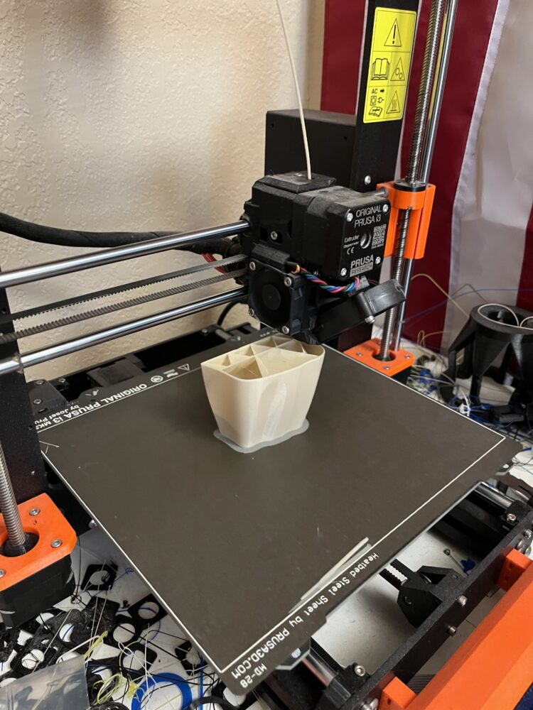
For constraints, I have the money, supplies, ideas, and room to work. I am skilled in SolidWorks and have learned how to effectively use surfacing. It is easy for me to sink time into personal design work, so allotting this so far has not been a challenge. 3D printing is relatively low cost, and I have a reliable personal printer (Prusa MK3s+) which allows me to rapidly iterate and complete manufacturing.
The constraints I primarily see is my lack of electronics and coding skills. I believe this to be overcome able however. I have:
- taken up to ‘Data Structures’ in C++
- fairly extensive experience in MATLAB
- personal connections with students experienced in these subjects
- online reference material of somewhat similar projects
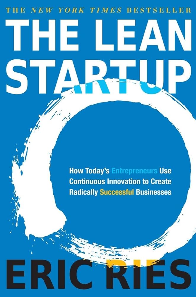
I have recently been learning a lot about product development, specifically the LEAN method (see ‘THE LEAN STARTUP ‘), and I plan on integrating this into my project. I originally had a plan to will pursue a ‘minimum viable product’ (MVP) first, and then improve upon it. It was going to be an aesthetically pleasing, wired mouse with left/right click, a movement sensor, and scroll wheel. However, I ran into some challenges and had to simply focus on the looks.
I am a fan of professional, elegant but bold aesthetics. In my original project idea of a barbell, I was also planning on integrating this idea. However, when I switched to my mouse, I wanted to come up with something a bit different to match the mouse better. Additionally, I kind of did another project altogether as well which I never ended up pursuing, which initially guided my aesthetic choice for the early mouse versions.
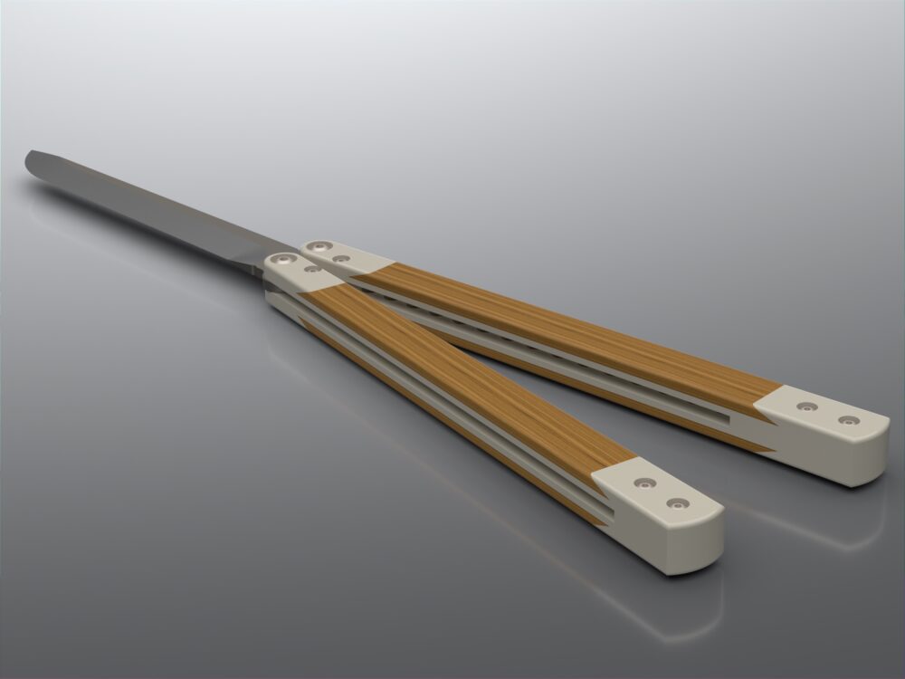
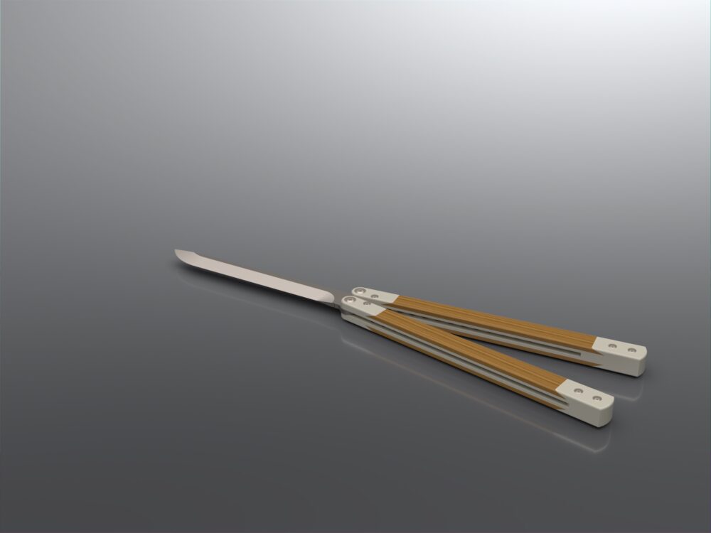
This other project, which I never posted about, was to be a minimalist-executive Balisong knife (also known as butterfly knives). While I am not actively involved in the hobby anymore, it is still something I enjoy, and own multiple. While Balisongs tend to have a negative social connotation due to their popular culture association with crime and general degeneracy, they are a form of art for many. This ‘art’ is multi-leveled, both in their physical design and how people manipulate them. I have owned both $10-Ebay and $800-custom balisongs, and near everything between. I know how they work fairly well from cleaning, tuning, designing, and flipping them (as well as getting cut by them obviously). Here are some (bad) renders of that design that I made, but did not continue with.
However, I knew this project would be a hard sell due to their reputation. Additionally, I felt I could learn more from creating a mouse. So, I had this clean, natural, minimalist aesthetic from the beginning, which I ran with in the beginning of the mouse project. I searched to find what this aesthetic was called. Eventually, I switched to the more traditional blue/white/grey/purple aesthetic. Here is what it initially looked like:

Goals vs. Reality
I planned on creating the outer body of the mouse utilizing surface modeling in SolidWorks in order to achieve a natural, smooth geometry. I decided to iterate and 3D print PLA+ shells of these simple bodies until I was happy with the feel of it in my hand, then move on to separating this body into individual components for the MVP. At this point I was going to split the single body into its individual components and utilize the ‘master modeling’ reference method for external part references.
My original plan was that I would print at least one of these versions to test assembly and feel. If it is went well, I would continue with electronics integration. If either of those steps did not go well (they did not), I would likely abandon trying to make a working mouse for the scope of this class, and instead focus on creating a shell that is aesthetic and comfortable. I would continue to add buttons and geometry as well as surfaces for different materials like soft-touch TPE.
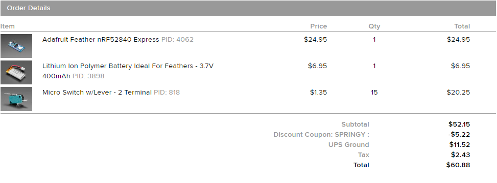
I ended up getting stuck on the electronics integration, and decided to focus on adhering to the aesthetic and creating an aesthetic mouse which fit. While the base shell and Left and Right click fit my hand and work well, none of the other buttons actually function currently. I decided to focus on making something which would look nice over something that I would immediately be able to make. While I do have plans to continue this project and make a functioning mouse. this is acceptable to me for the scope of this class. I still ordered electronics however:
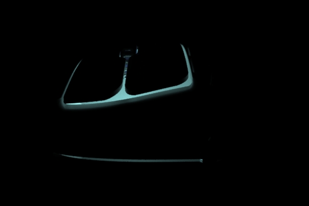
Here is a link to a video animation of my mouse, which is effectively my final deliverable/prototype due to the fact that I cannot make a functioning mouse at the moment.
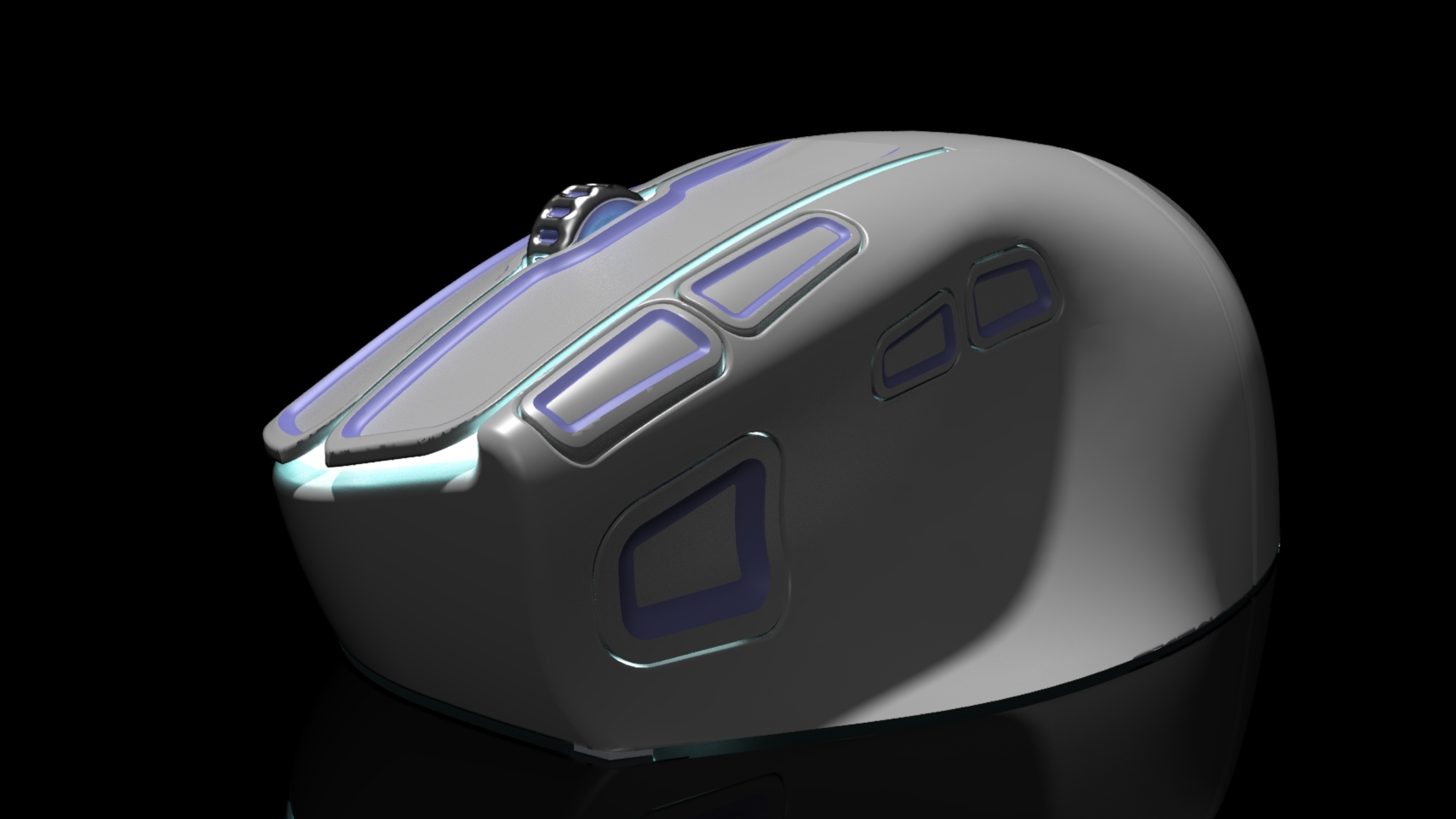
The video is done in the style of a tech company teaser hype generator product release video. So the low lighting is intentional. Below is a still, semi-final render of the mouse:
Here is a preview-quality render of the mouse in well lit conditions (the rendering is acting strange):
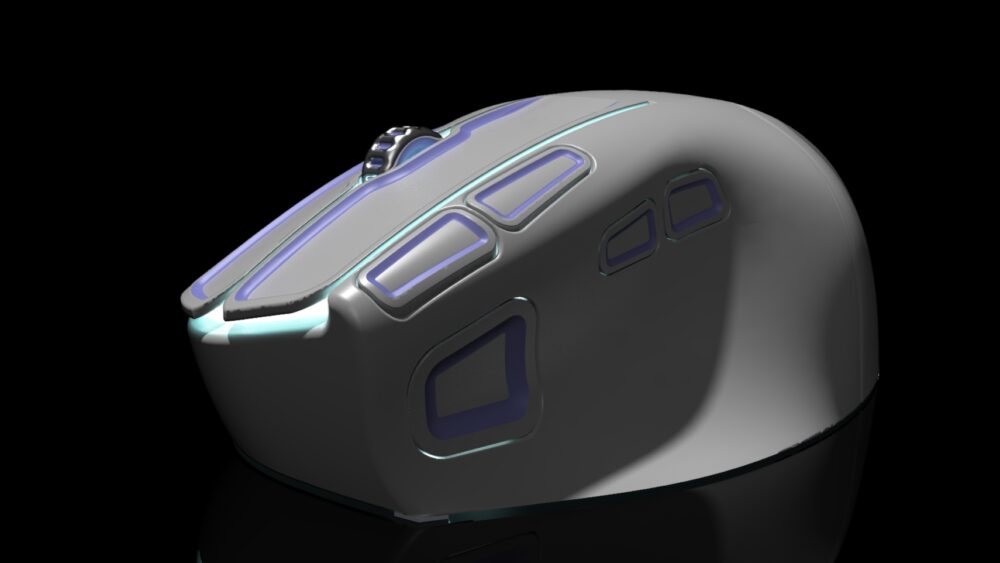
As the picture illustrates, I made sure to integrate my chosen aesthetic both in form and color. The buttons all include the drop shadow effect that is common in neumorphic user interfaces, and the actual profile of these buttons and drops are typically 4 sided geometric shapes with rounded corners. While this geometry was extremely time consuming to create, I think the end result looks quite nice. Additionally, the color of the mouse adheres to the aesthetic by having a base color of slight off-white, with accents of light purple and blue, with a secondary base color of light grey. All of this comes together to give a nice, elegant but eye catching, techy look which is not overly aggressive.
2 Comments. Leave new
Hi Peter. I think this was a super cool project and definitely a big undertaking. I designed and built my own keyboard with not much electronics experience, so I absolutely understand. I thinnk you made a great choice on focusing on the aesthetics for now and leaving the functionality for later.
Hey Peter! I really liked reading about your design process and what happened along the way. I think your decision to skip the electronics and go for something that felt good was the right move. How many iterations did you have to do before it “felt” right? How could you tell when things felt right? I had to do quite a bit of ergonomics for my senior design project and walked away having a deeper appreciation for how difficult something that looks so “easy” can be. So congrats on diving into something that is deceptively difficult!