

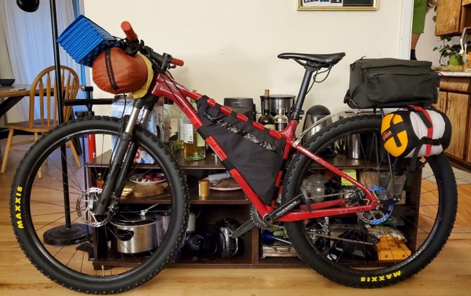
To give some initial context for the final project, I created a bikepacking frame bag that will allow me to pack camping gear and food into my bike. This product is advantageous because I can take weight off my back to be more comfortable while I’m biking. I plan to use this bag on an upcoming trip this summer. This blog post will cover the actual construction of the bag and the future plans with the bag.
Below I attached the full project time line.
- Product Ideation: 3/4/24
 https://evocsports.us/collections/on-bike-bags
 - Initial Design Sketches: 3/8/24
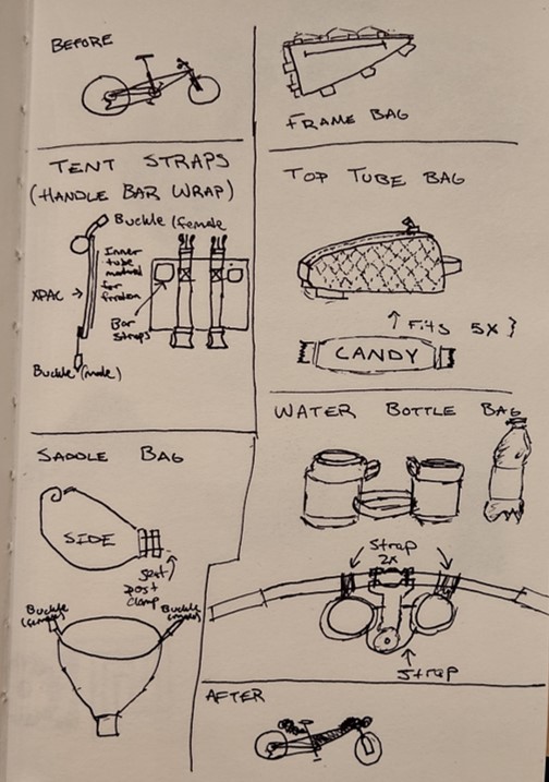
- Design Preview: 3/13/24
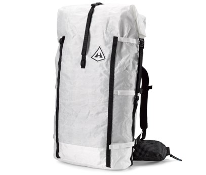 https://www.hyperlitemountaingear.com/
 - Final Drawing Release: 4/5/24
- Material Shopping: 4/11/24
- Sewing: 4/18/24
- Logo Sketching: 4/20/24
- Logo Creation: 4/21/24
- Final Bag Integration: 4/22/24
- Test Run and Documentation: 5/1/24
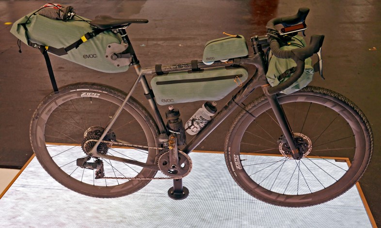
When I started the semester and listened in on the first few days of class I was immediately inspired to pursue this bag concept for my bike. Initially I wanted to create a series of identical bag that would attach all around my bike. I was interested in the project because I plan to complete the Colorado Trail this summer. Once I finished the upcycling project, I started focusing in on this project. I started by researching existing design solutions from other companies to see what I liked and what I didn’t. I made sure to branch out from bike gear specifically and look at the outdoor gear market as a whole. I realized that I wasn’t happy with off the shelf solutions because they don’t effectively utilize the space of unique shape frames (like my mountain bike). This work lead directly into the design preview where I pitched my initial design goals. I showcased my design sketches and image of my previous bikepacking bag I created. In the preview I highlighted my identified design flaws in the current product and my initial design goals. During the presentation I pitched another black bag with more color accents to slightly personalize the bag. To further the personalization I wanted to investigate a logo or patch to add to my bag. After the critique was over I went on spring break and had a lot of time to think about my design goals. I realized I wasn’t happy with the initial design because it didn’t feel very novel. It felt like I was just recreating the bag I already made in the past. I attached an image of my old frame bag below.
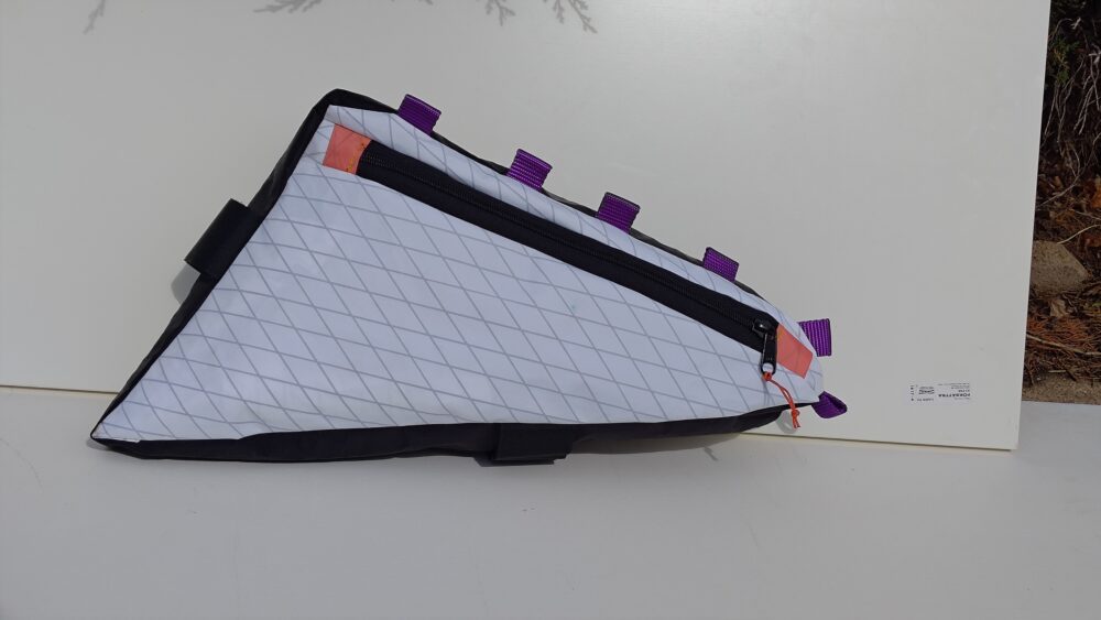
So I went back to the drawing board and focused on more product ideation. This eventually led me to realize my project aesthetic. I wanted to follow in the steps of companies like Cotopaxi and Hyperlite, to develop a minimalist outdoor bag with lots of unique and different colors. Hyperlite utilizes a white rip-stop fabric on their bags. I therefore wanted to use white on my bag as an homage to them. I think the bag will become weathered looking as I use it over time. It will develop a sort of patina, that will change the bag’s look with time. To make the bag a little more unique I wanted to add bright color splashes due to the Cotopaxi inspiration. Most bike gear comes in very neutral, boring colors. Beige, brown, dark green, black, and navy blue are all colors very commonly seen in bike bags. They are subtle and blend in with the bike rather than popping out. I decided I wanted to create a really loud bright colored bag. I figured it would make my bag look more custom and hopefully get people talking about my gear. The goal was to create a product that looked interesting on it’s own rather than an all black bag that simply matches my bike. I already have a bag that matches my bikes aesthetic. For this project I want to create a bag that stands out on it’s own and tells its own story.
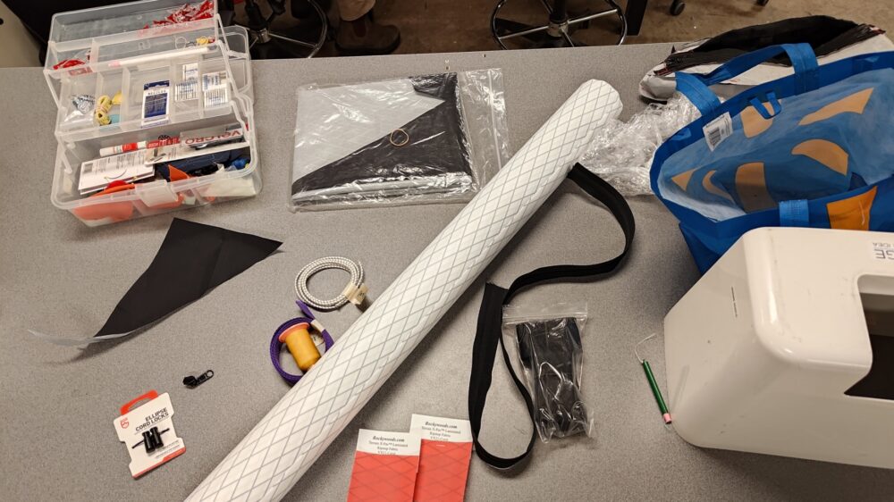
Using this new found aesthetic and motivation I completed my final drawing release. Once I had that design I started planning the construction of my bag. I drove to Loveland, where I found the store Rockywoods Fabrics. Rockywoods is a small business that specializes in high tech fabrics for use in outdoor gear. It was a really cool experience to go there in person because I talked to the employees working that day about my design. They give me a lot of helpful pointers regarding the sewing process. They also helped me select the ideal fabric for the design and the proper thread to use as well. In my old bag I used whatever thread was already in the sewing machine. This time I was confident I was using exactly the right materials for the bag. After spending an hour there, I was supplied with a yard of white VX21 Terrain X-Pac Laminated Ripstop Fabric, a yard #8 Coil YKK Zipper and metal sliders, Gutermann TERA 80 100% polyester thread, and two coral VX21 Terrain X-Pac Laminated Ripstop Fabric samples. This totaled to $42. Then I drove to McGuckins to buy the bungee cord, toggle stopper cord, gear tape for the logo, and purple webbing. This came to a total of $12. With these materials I had everything I needed to start sewing my bag.
I documented my fabrication process with the attached video below.
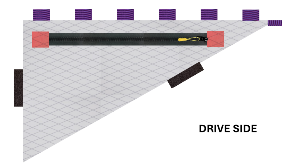
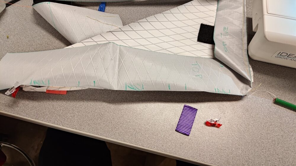
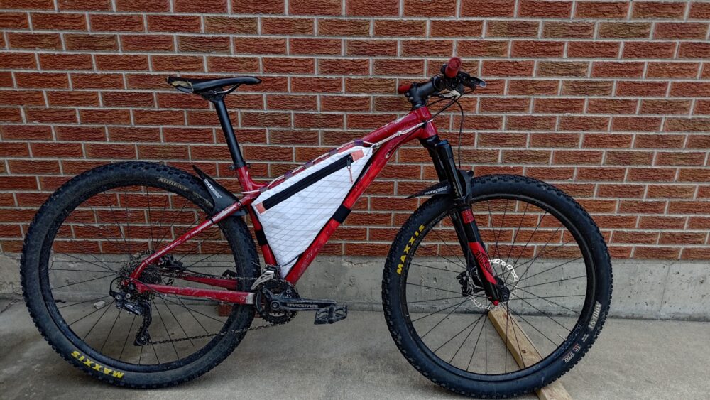
To make the bag I needed to get the initial dimensions. I initially taped the fabric to the frame of my bike and traced out the central triangle shape. I cut out this test panel to test initial fitment. Luckily this panel was just a test piece because I realized I had the fabric inside out. I was really concerned this piece would be too small so I increased the size of the actual panel by an entire inch on every edge. I figured I could always rip out the seam to make the bag smaller but I couldn’t add more material later. I decided to just send it with the dimensions I had and added the zipper. To create the zipper panel I cut the panel an inch narrower on the top to account for the zip thickness. Then I cut that panel in half. I had to sew in the small coral squares and some additional white square to nicely box in the zip. I then sewed all the pieces together to form the first panel. The other side was a lot simpler since I didn’t need to incorporate a zipper. I then cut out the spine of the bag with black X-Pac fabric I had laying around from my old bag. I used this to create a nice contrast with the white panels. From this point I just needed to sew the panels together while adding in webbing loops and Velcro where I wanted my straps. I didn’t really plan out the locations for the Velcro straps, I just added where I thought made sense. The webbing loops were spaced every 2 inches. I also added a bit of webbing on the top right corner of the bag to allow me to pull the triangular shape taught. The biggest risk here was accidentally sewing the Velcro backwards so it doesn’t adhere to the other side. Luckily, I had experience with sewing before and didn’t have this issue. After sewing the panels togethers I just had to turn the bag out. Note that all the sewing I did was from the inside so I don’t see the final results until everything is sewed together and turn the bag out. I then installed my bag on the bike and the majority of the construction was complete.
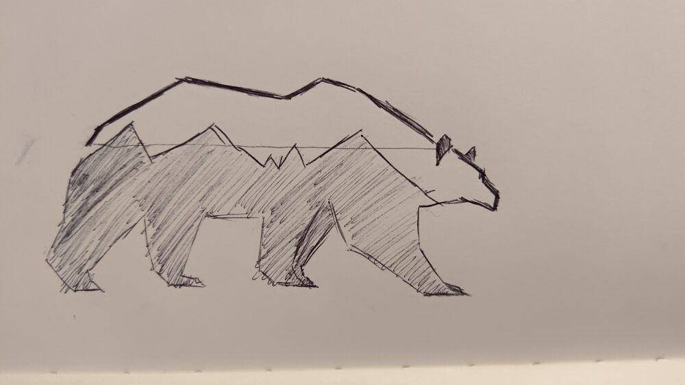
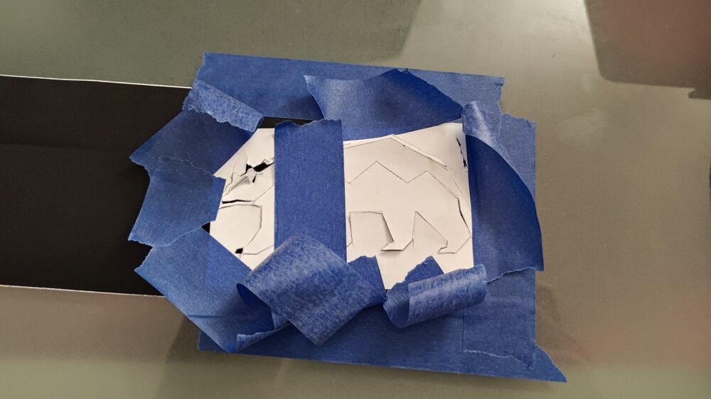
The bag had some lingering final touches, specifically the logo. I went and sketched an angular design to match the angular nature of my bag. This logo was also meant to be minimalist and outdoorsy to tie in the overall aesthetic of the bag with the “company branding”. I went and inserted this initial drawing sketch into Solidworks. I used the image tracing tools in the sketch tab to create a 3D part of the logo. This was used in making a .dxf file that I could then use in a CNC machine like a laser cutter. Upon talking with the ITLL, I realized laser cutting a plastic sticker was going to end poorly. So I simply printed the logo on some paper and taped it to the tape. I tried using an X-ACTO blade to cut out the sticker. This failed majorly because the fabric had a tendency to tear. What I found worked best was actually a pair of scissors. Scissors are nowhere near as precise as an X-ACTO blade which meant my final sticker came to look a little bit different than the sketch I had in mind. I would like to try a Cricut machine in the future. I used this at my last internship to cutting sheets of thermal interface material and RF absorber material. It works like a dream, cutting unconventional materials. I bet this would work well for the gear tape. Even so, I was happy with how the logo turned out. I stuck the sticker to by bag. Now all I have left to do is give the bag a good test run.
The final product ended up looking drastically different than my initial plans. I intended to essentially copy my previous design and make a couple functional modifications to improve the bags performance. After design reviews and a lot of time spent thinking over spring break I came to the realization I wasn’t happy with my project. It was boring and didn’t suit the goals of this class. This class is all about making something look good and matching an artistic vision. I had no initial artistic vision, and I think it shows based off my initial passion regarding my first design. Upon reflecting on the design I was able to make a lot of bold decisions regarding the color and dynamic aspects of my bag. I simplified the bag, leaving only a single zipper to act as my dynamic element. This allows the bag to change in shape, weight, and looks, as different gear is stuffed into it. The dynamic part of my product is a little gimmicky if I’m being honest, but I think it still works as a product that changes in time. The use of a single zipper with no organizational systems in the bag was motivated by capturing the essence of the outdoor minimalist aesthetic. To add to the minimalist aesthetic I wanted to include a few splashes of color that made my bag look loud and interesting while still maintaining a simple color way. I focused on using unique colors that aren’t typically used in this application. This allowed me to come up with a unique design that is sure to spur conversation along my journeys. After the design critique and conversations with my roommates, it sounds like the color scheme I chose is somewhat controversial. I personally am stoked about the end result. I think the color is super unique and expressive. Other’s seem to prefer the all black design of old. I appreciate their feedback but still stand by my choices because I was motivated to make a product that could stand on it’s own. It didn’t need to be on a bike to look good. I stuck to the vision and thus created a one of a kind bag. In the future the biggest changes I would make is to do with the logo. I came across a lot of issues trying to get the end result to look nice. Using different cutting techniques in the future would be a great decision to make the design closer in mind to my original drawing. In the future I plan to use the bag for my trip.
I hope it performs as good as it looks!
1 Comment. Leave new
The bag looks sick! I think it came out really well and I actually think the logo came out great. It looks like a professional product! I’m excited to see how it fairs on the Colorado trail.