
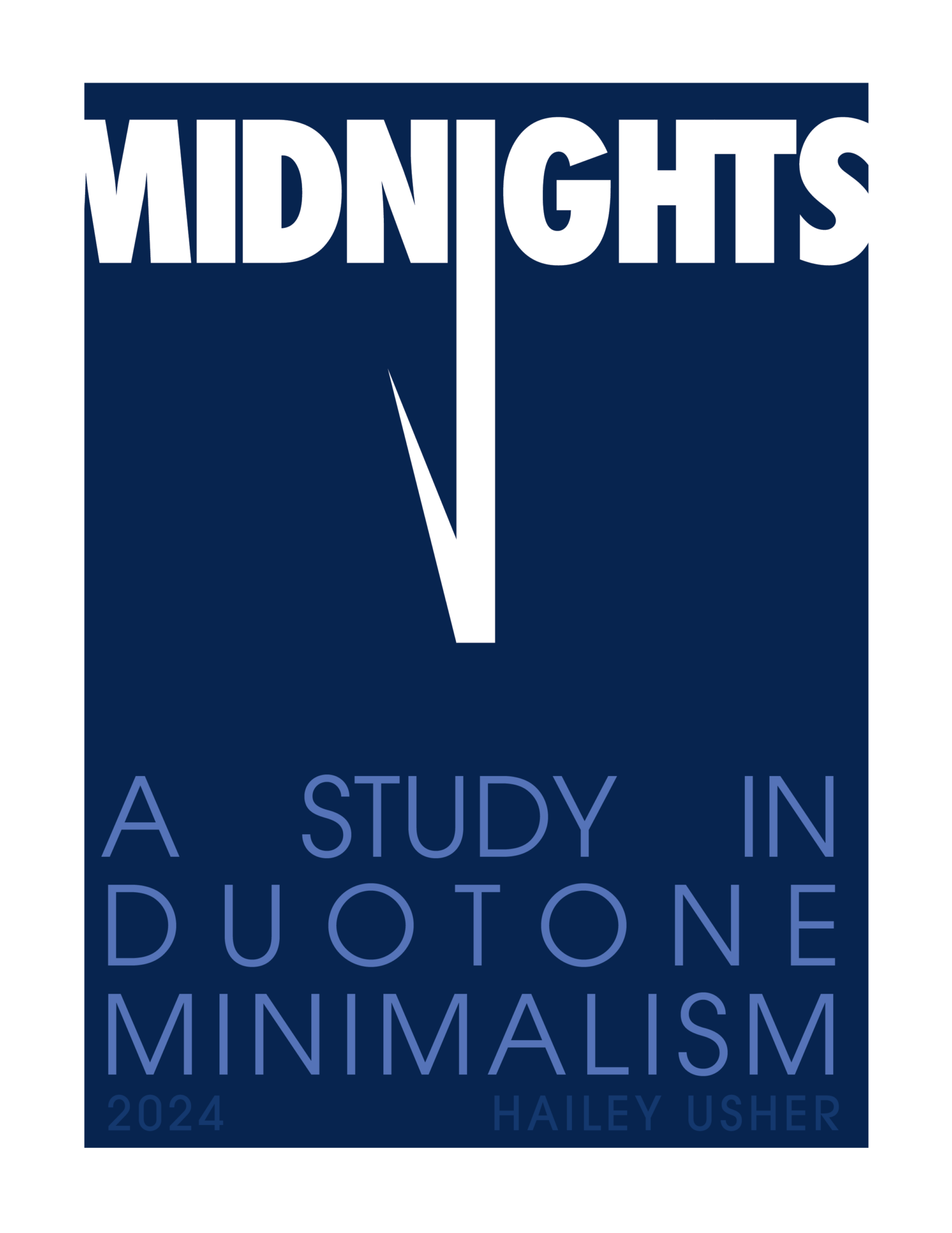
Blog Post 12
Midnights Booklet: Documentation Part 2
Introduction
Hi everyone! In this blog post, I’ll be documenting the back-half of my design process leading up to my finished product.
Timeline
Before I got started, I created a timeline of small goals to reach up until the due date of the project. While this doesn’t have to be a rigid schedule, I think it will be useful to have checkpoints so I’m staying on-time and leaving room for “error” with this big project.
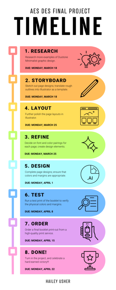
According to my timeline diagram, these are the steps I think the design process of my booklet will require:
- Research more examples of Duotone Minimalist graphic design.
- Sketch out page designs; translate rough outlines into Illustrator as a template.
- Further polish the page layouts in Illustrator.
- Decide on font and color pairings for each page; create design elements.
- Complete page designs; ensure that colors and margins are appropriate.
- Run a test print of the booklet to verify the physical colors and margins.
- Order a final booklet print-out from a high-quality print service.
- Turn in the project, and celebrate my victory!
Design Process
As I touched on in my previous blog post, I began my design process by laying out the page designs in black and white Helvetica in Illustrator.
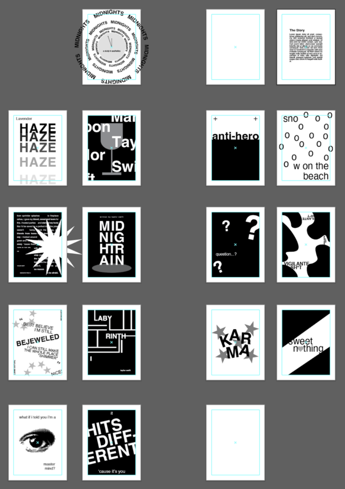
Once I had my rough layout, I could then go page by page and add color, type, and other graphic elements. Looking back, I’m glad I started out with my black and white layouts because it helped me to view the booklet as a whole entity throughout my design process.
Overall, the design process was a tough but fun challenge. For each page, I started out in Photoshop by coloring any graphics I needed in a Duotone color scheme. I chose mostly complementary colors, or color combinations that I thought looked nice together.
Then, I switched over to Illustrator to work with type layouts. As a rule, I stuck with sans-serif fonts for a more consistent look; however, I did play around a lot with my font choices to make each page feel more distinct and interesting.
Going through this process helped me a lot in understanding how Duotone Minimalism, as an aesthetic, functions. On several occasions I caught myself making a page feel too “busy” and had to pair down my design to adhere to the aesthetic.


Before/After of “Bejeweled”


Before/After of “Karma”
Roadbumps
This project was definitely not without its challenges. One major thing I struggled with throughout my design process was my desire to make each page “perfect” in my mind. I struggle with OCD, so I found myself spending hours on a single page layout, unhappy with each new iteration. During this struggle, I found clarity in choosing my designs by sending my favorite iterations to my dad, who’s a graphic designer. By taking his feedback, I was able to finalize page designs a lot easier.

Before/After Iteration of “Question…?” Layout

Before/After Iteration of “Hits Different” Layout
Additionally, the entire booklet layout was a major point of difficulty. This was because working with a limited color palette meant that I tried not to repeat colors through the entire booklet, which stopped me at some points as I struggled to find colors that both worked well together and didn’t mirror any of my previous designs. I overcame this struggle by turning to online color books, which helped me discover new combinations.
Final Product (Then vs. Now)
Overall, I’m extremely proud of my final product. I think the print looks amazing and I’m super happy with the colors in their printed form. I feel much more confident in my design abilities; I feel I overcame my mental block of limiting my color scheme as a designer/artist. I also feel much more competent at graphic design-work in Illustrator as a program.
Overall, I feel that I succeeded in maximizing my workflow through checking in with myself constantly, as well as quickly pivoting when something just wasn’t working out for me. I enjoyed this personal challenge of creating 16 individual design schemes, and I might even add to this booklet–with more of Taylor Swift’s bonus tracks from Midnights–in the future.
I hope that you enjoy the graphics I created for this project. I’m not sure if this will work, but here’s a full PDF of my designs if you want to take a closer look. Looking forward, I’m pumped to show off my booklet during Expo! I’ll see ya’ll there!
2 Comments. Leave new
[…] here’s the blog post link with more information […]
Hi Hailey! I love your design and I think the edits you made to them look great. I really like what you did with Lavender Haze and Labyrinth! I was wondering what you’re going to do with them now? Were you thinking of making prints of them for room decorations? I would love something like what you made as a cute art piece.