
Cyber Helmet:
For this project I was inspired by designers that I enjoy to follow and some things from my childhood.
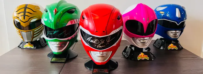
I want to create a helmet that is made of cardboard and resembles the brutalist and cyber aesthetics. My first source of inspiration comes from Japanese manga artist Shotaro Ishinomori. He is the one who created the idea and design for the Power Rangers. Growing up I felt very inspired by the sleek and stealthy looking design of the characters. I remember dressing as them for Halloween whenever I could and the helmet was the most important part. I am hoping to draw inspiration from the clean and simple lines and creating distinct futuristic looking details.

My next source of inspiration comes from a young designer I have been following for a few years. He goes by @yalocaloffgod on instagram or just Off God in short. He recently worked with Bape and also helped popularize headphone attachments on the new Apple over-ear headphones.

In this example you can see how he uses 3D printing to create these very organic shapes and an eccentric silhouette. For my project I want to take that elaborate and outrageous approach to my helmet. Adding some organic shapes and eccentricities to the outside of my helmet almost representing headwear worn by Pharos.
My next source of inspiration comes from another manga artist Kentaro Miura who created Berserk. This is an epic/dark fantasy filled with crazy depictions of stylized armor.


For these images I want to focus on what is going on around the helmets. The raised surfaces and ridges create a grungy feel that really inspires me and I hope to be able to create a silhouette that is similar. On the contrary the middle image shows something similar to the Power rangers so I will have to play with both styles and see what feels right. Overall this gives me a lot of direction and shows me that anythings is really game when it comes to the style of a helmet. I see now that both examples have the mouth missing for most of the depictions so maybe I can incorporate that too.
For this project I wanted to focus on getting the aesthetic to a place I felt I saw in my head. My aesthetic comes from my experience with design and how mystery has always intrigued me. I wanted to create something that would make people want to know whats behind the mask and something that may be the future of our wearable technology. I want this to feel like it is from the future. For the function size I want to be able to wear it and maybe have modular visors/decor.


I first started with my sketches. Based off of those I started to make a template of my head. Slowly by cutting out pieces I started to make the shape of my head.


Looking at the left photo above you can see the funny shape on the right. That was my first small scale prototype of the front of the mast and ended up becoming the headpiece. Next I created the inner visor and painted the head silver. after that I started to create the visors and side head pieces. Overall it was a tedious process but just going one step at a time helped.

Finally I added the visor but felt like it needed a little more flourish. you can see the wing like side pieces on the table below and thats what I decided to add.
As you can see in the video my helmet is a little small and is something I thought I had covered before I painted it. For my first time doing it I was very close but in the future I will just add a couple more inches to the pieces I cut out.


This is my final and I am very happy with how I came out actually. When it comes to my functional goals I failed and succeeded. I was able to make the visor modular and while it is not a very good design it works. I think if I were to do it again I would add hooks so it is much easier to clip them on and off. I failed because I was unable to make it very wearable. It works but its not very comfortable and not very function in that sense at least for me maybe for someone with a smaller head it would be good. I think my object very much suits my aesthetic. I took a lot of inspiration from the Power Rangers and that really shows. I was able to blend the cyber with the medieval knight helmet and it came out awesome. For what is next there is a lot. As I said before I wanted this to be a prototype for a better helmet in the future. This helped me find a rough idea of the dimensions I need and what design I like already. I want to refine the design and maybe resin print a version of this mask. It would make it much cleaner and maybe I could even add more cyber elements onto the CAD model. Overall I had a blast doing this project and hopefully everyone can buy one of my medieval cyber helmets :).
Color change shirts:
Hey! How’s it going. Im pretty stressed out just to be honest but I am super jazzed on this project. So to start off I’ll give you my vision. Recently I have been inspired by the idea of color theory (partly because of this class) and have always had a fascination for flowers. To combine these 2 ideas I thought why not make some shirts so that is how the idea was born. I wanted to use natural dyes to create a unique gradient and to add my dynamic piece I thought that maybe the colors could change using thermochromic dye. At first I had no idea how this would work or even if the idea is possible but why not try :). I have used natural dyes in the past so I was confidant that I could make a cool shirt either way just not positive if the color change would work.
So once I got all my materials together I ran into a problem. The thermochromic dye is very expensive and I am very very broke. Without much worry I decided to go full steam ahead and not worry to much. A backup plan I had was to use one of my screen designs I have made and make the color change happen with fabric dye instead of the whole shirt and that is what I went with in the end. To start I first boiled my special berry blend (recipe protected for my future sales and design book) to create the first step of the dye. For the gradient I wanted to make I decided to first only let the fruit boil and then I killed the heat. Using test strips I knew the dye would work and I could start with a lighter color. Here is a video of the first dip. First Dip.

After this first dip I started to get excited because my special berry blend turned out to be my newest favorite color:
Mauve.
Its a very special color to me and I would encourage you do look into it yourself.
To get back on track check this video of how the shirts looked after the first dye. Shirts after round 1.I was really happy with how these started to come out and was ready to get my gradient on. After adding some more of my secret fruit to up the concentration I let it boil for about 10 minutes or more I wasn’t keeping track. The smell was pretty awesome and even the shirts smell very fruity now haha. After a good boil I strained all of my fruit and kept boiling everything down. For my second dip I only put the shirts in half way and I discovered I could use tie dye techniques to create some flower like circles around the shirt. Here is a photo of how the shirts turned out after the second dye.
I loved the look of these and really feel like my aesthetic of soft colors/bloomcore and gradients really came out (in my eyes). Next to add my dynamic part I wanted to make my graphic change color in the sun. Sadly my video is missing but my group-mates can attest I had a cool video showing the colors going into the fabric dye. In the end my colors sadly did not fully come through and I think I would need a more neutral base dye and or more thermochromic dye. After adding all the dyes I decided to go with the red-yellow changing color just because I felt it matched my mauve the best because after mixing it became a light pink color. I had no issues with my screen printing and how it wasn’t my main focus for this project I did not highlight that process maybe I can explain more next week. All and all could I get a little drumroll and here is the video of my shirts ? Final Shirt. I hope to bring some to the expo and maybe sell some shirts. If you like my designs check out my website at collinlkendall.com to see what I am making and maybe someday soon I will be selling my clothes from there. you heard it here first.
Work Cited:
(1): Wikimedia Foundation. (2024, January 30). Power rangers. Wikipedia. https://en.wikipedia.org/wiki/Power_Rangers
(2): Instagram. (n.d.). https://www.instagram.com/yalocaloffgod/?hl=en
(3): Wikimedia Foundation. (2024b, January 31). Berserk (manga). Wikipedia. https://en.wikipedia.org/wiki/Berserk_(manga)
(4): All the rest are from me