
Paper Mache Head (Inspired by Duane Flatmo)
The inspiration for my upcycle idea came from an aesthetic that I experienced about 10 years ago, but have never forgotten about. From 2010 to 2014, I lived in Arcata, CA while studying at Cal Poly Humboldt (which at the time was Humboldt State University). Arcata is in northern California (figure 1). In relative driving terms, it takes 5 hours to drive from San Francisco to Arcata along the 101, which features an isolated drive through several groves of redwood trees.
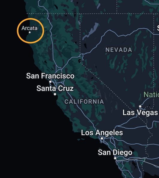
Image 1: Arcata circled on a map of California
During my time there, I saw several street murals and distinct logos that were interesting to me, but took me years to look further into. I think it is interesting how murals and artwork of an area define the place and give the buildings regional flavor. I saw this artwork in both Arcata and Eureka, CA. Eureka is a larger city about 8 south miles of Arcata. The artist is Duane Flatmo, who is a local artist in Eureka. One of the first pieces I saw done by Flatmo and leaning towards this aesthetic was a mural in Eureka on the side of a sporting goods store called Bucksport (figure 2). Flatmo painted this mural in 1996. There is a strong emphasis on particular facial features and emotion within the subjects. The contrast of light along parts of the faces give another dimension to them. All of their faces seem cartoonish, but still relatively normal.
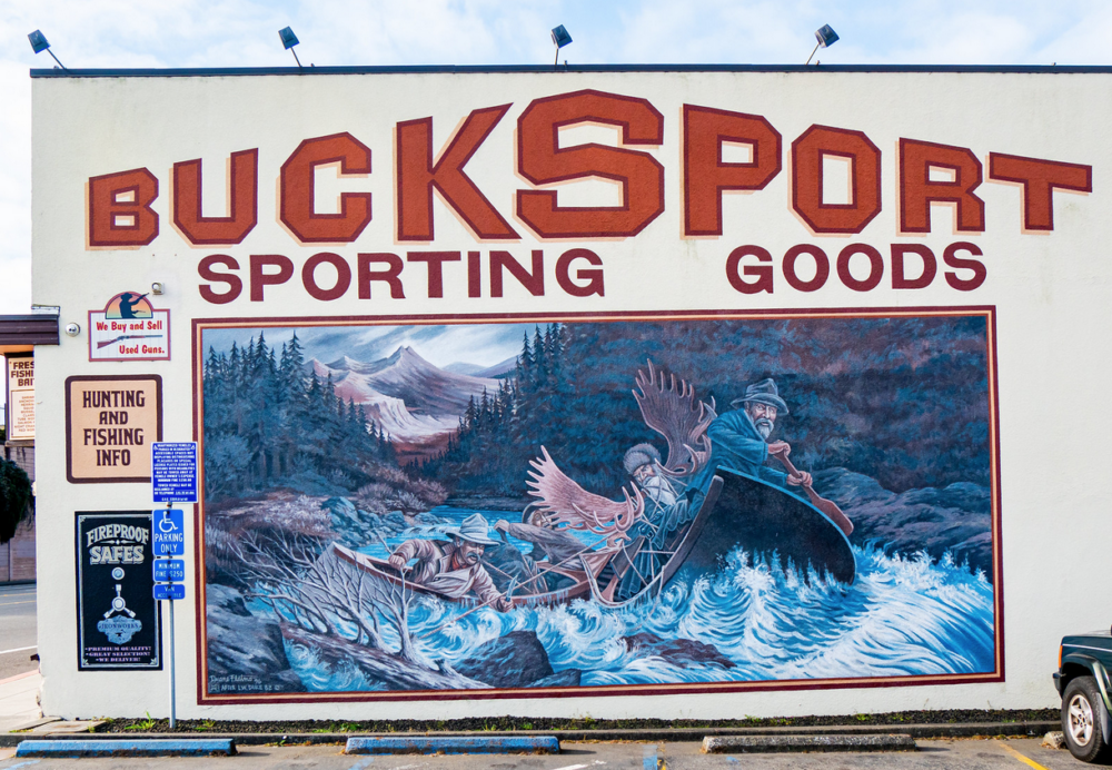 Image 2: Bucksport Mural by Duane Flatmo (1996) (2)
Flatmo painted this mural in 1996. There is a strong emphasis on particular facial features and emotion within the subjects. The contrast of light along parts of the faces give another dimension to them. All of their faces seem cartoonish, but still relatively normal. From then on, I started noticing more of his artwork and noticed how abstract it was.
After this street mural I noticed that several of the logos on the beers made by Lost Coast Brewery were done by Flatmo with an abstract aesthetic (figures 3,4,5). I like the facial and building distortions that appear in this style. They all seem inspired by cubism in the sense that each section of the image contains multiple perspectives.
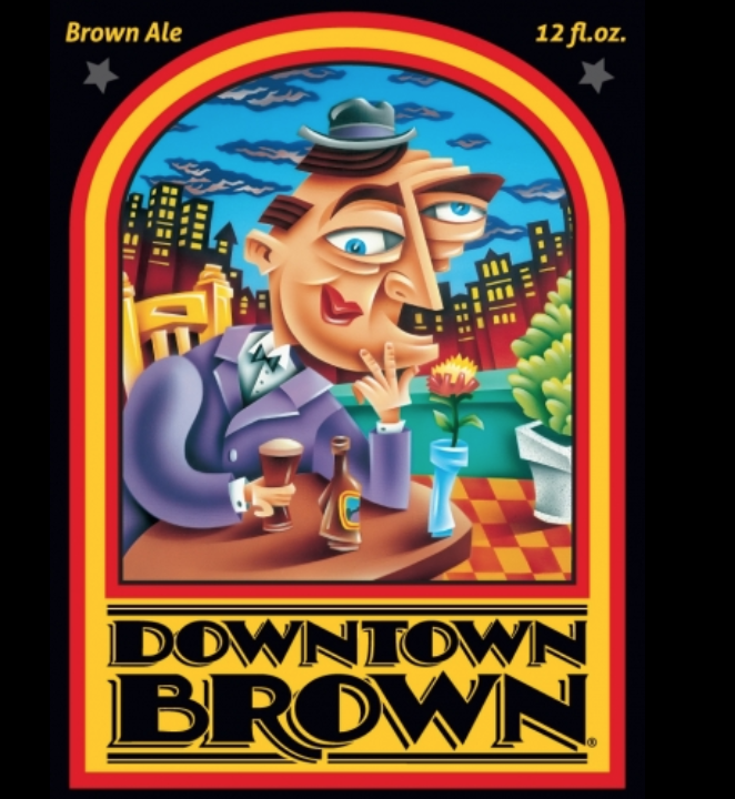
Image 3: Downtown Brown Ale Label by Duane Flatmo
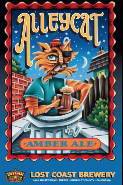
Image 4: Alleycat Amber Ale Label by Duane Flatmo
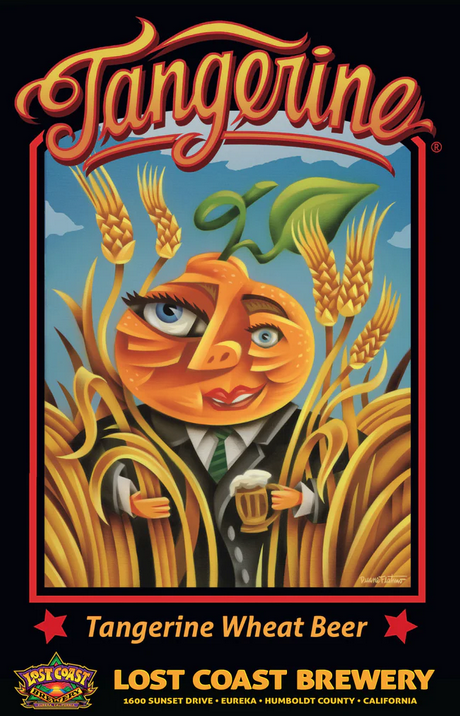
Image 5: Tangerine Wheat Beer Label by Duane Flatmo
My goal for the upcycle project was to create a three dimensional head that is inspired by Duane Flatmo’s style, surrealism, and cubism. The idea was to have the face contain multiple planes to show different perspectives of the head while looking at it in a certain way. I wanted there to be an emphasis on certain facial features over others. My vision was to exaggerate the uneven facial characteristics that we all have and the beauty of certain features coming out more than others. .
I originally planned on using cardboard, foam, and tape as the structural materials. However this plan ended up shifting after I watched a video made by the artist Rod Bergeron on how to create a marionette head, using paper mache. I ended up using the following materials for the project:
- Baking flour (fine grain)
- Water
- Newspaper
- Part of an egg carton
- Kleenex
- Scotch tape
- Acrylic paint
- Glue
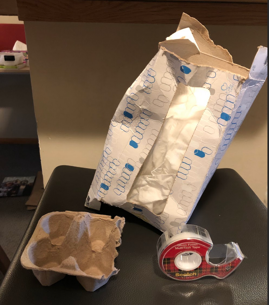
Image 6: Materials for Head Construction
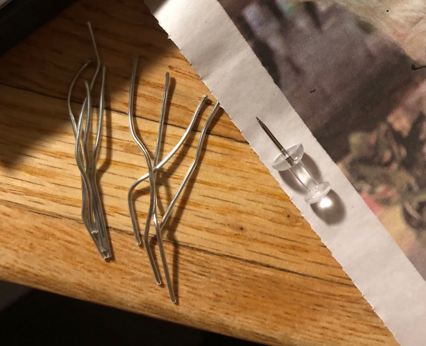
Image 7: Materials to Tack on Facial Features
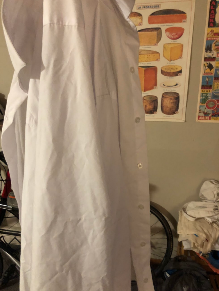
Image 8: Shirt to Create Eyelids
I then drew what I wanted the facial features to look like.
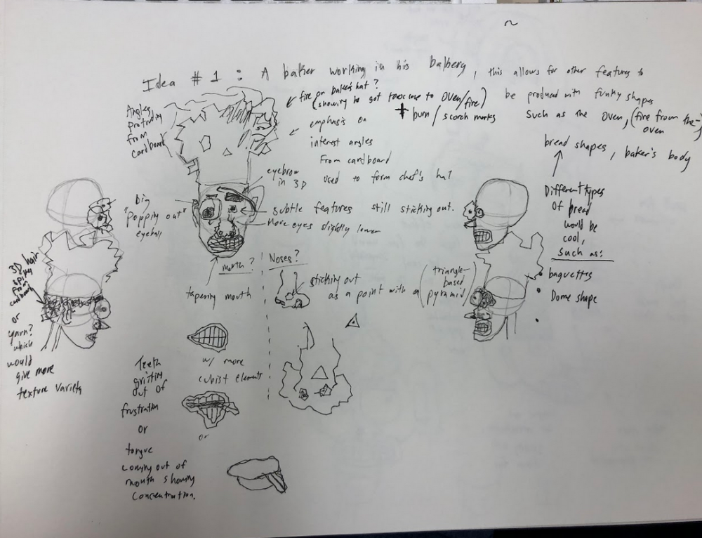
Image 9: Ideas for Facial Features.
Once I settled on how I wanted the facial features to appear, I emphasized the asymmetry in further drawings. I first planned on making t a strange 3D head sit on a body made out of 2D pieces, but in a 3D pose. The paper mache process ended up taking more time than I originally thought it would, so I focused on the head and face only for the paper mache. The sketched out features can be seen in the following drawing.
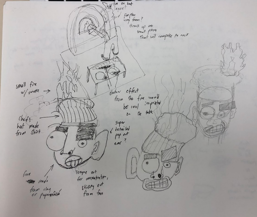
Image 10: Drawing of Exaggerated Facial Features.
After all of these ideas were set out, I put together a frame for the skull that I would use to hold the paper mache.
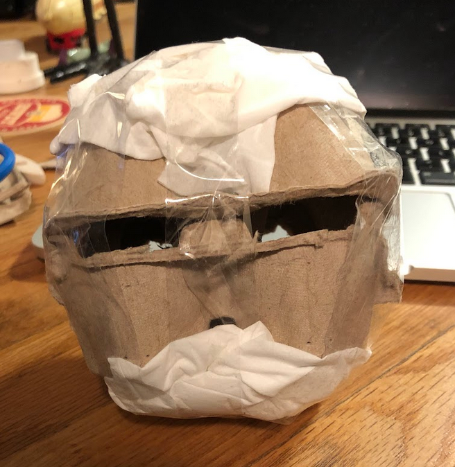
Image 11: Framing for Skull
I then put a layer of paper mache on to the frame for the skull.
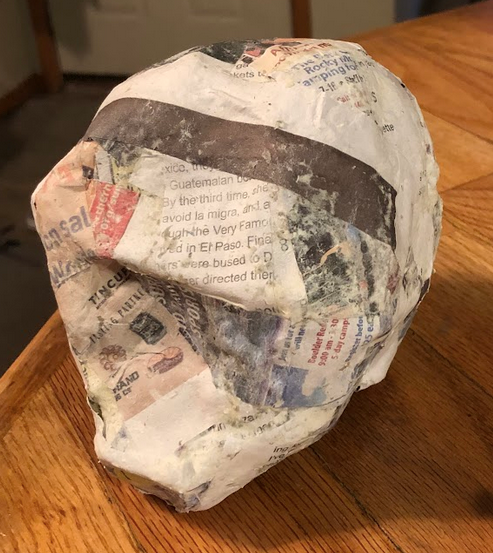
Image 12: Layer of Paper Mache on the Skull
After this, I made the other facial features that I needed out of paper mache and went through the process of painting them out of acrylic. I then poked holes in the features with a thumbtack and used bent open paper clips and glue to secure the facial features. I tried to make the face evenly balanced in the sense that a large eyebrow would balance out a small eye and vice versa. The following pictures display the process and different angles of the final product.
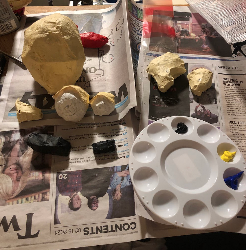
Image 13: Painting Process
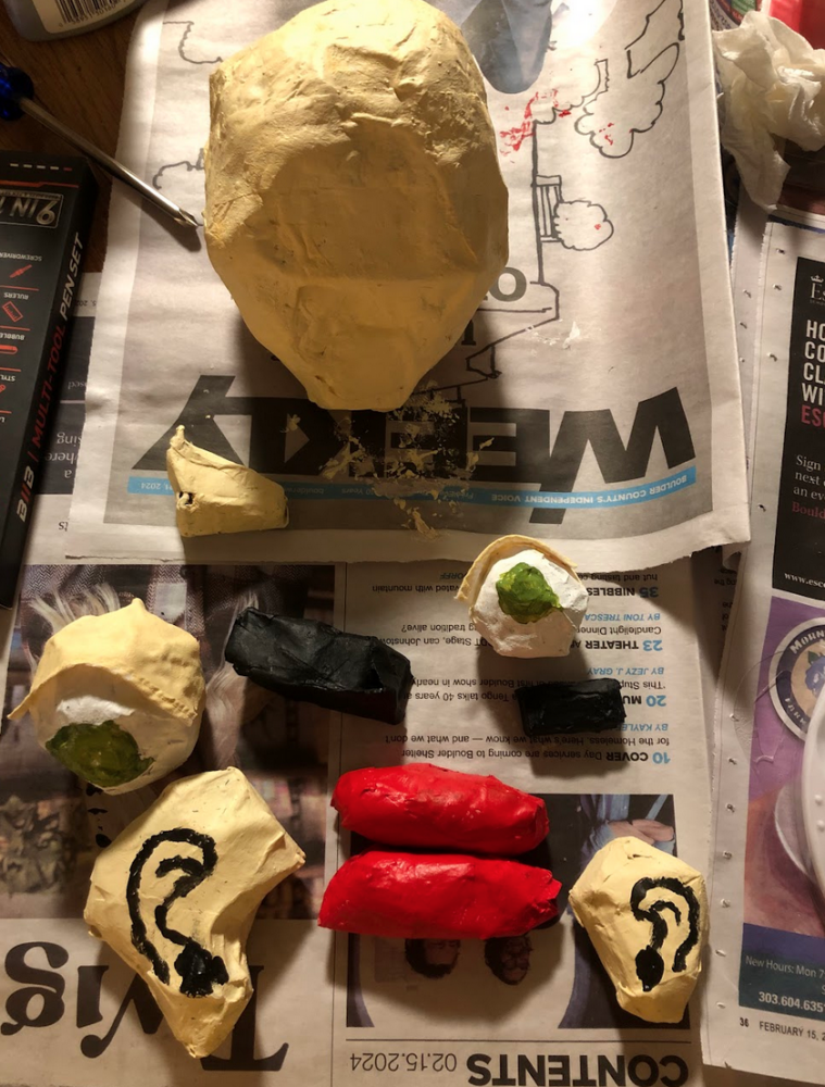
Image 13: Painting Process Continued
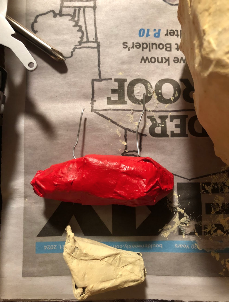
Image 14: Paper Clips Plugged into Lips for Securing onto Head
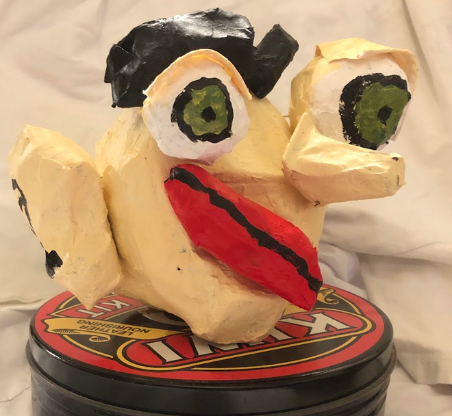
Image 15: Final Product
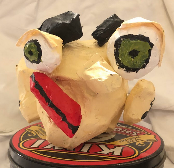
Image 15: Front View
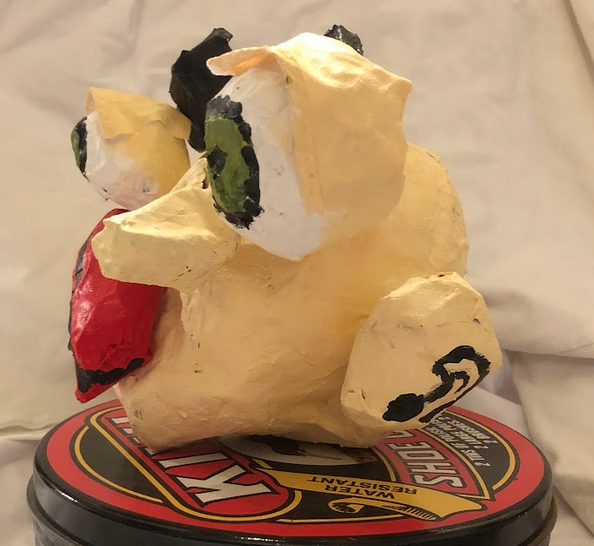
Image 16: Side View
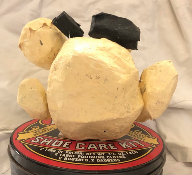
Image 17: Back View
My final product differed from my original plan. I originally wanted to make a scene out of cardboard that would be similar to Duane Flatmo’s artwork, but constructing the head out of paper mache was more time intensive than I thought it would be. At the end of the project I was still able to achieve my aesthetic goal of making a head that had a similar style to Duane Flatmo’s artwork in the 3D realm. This can be seen in the abstract facial features and abstract placements.
My next plan is to create another head with refined paper mache and painting skills to make the final product appear more clean.
1 Comment. Leave new
[…] Paper Mache Head (Inspired by Duane Flatmo) […]